OtpEditText
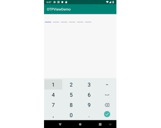
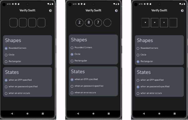
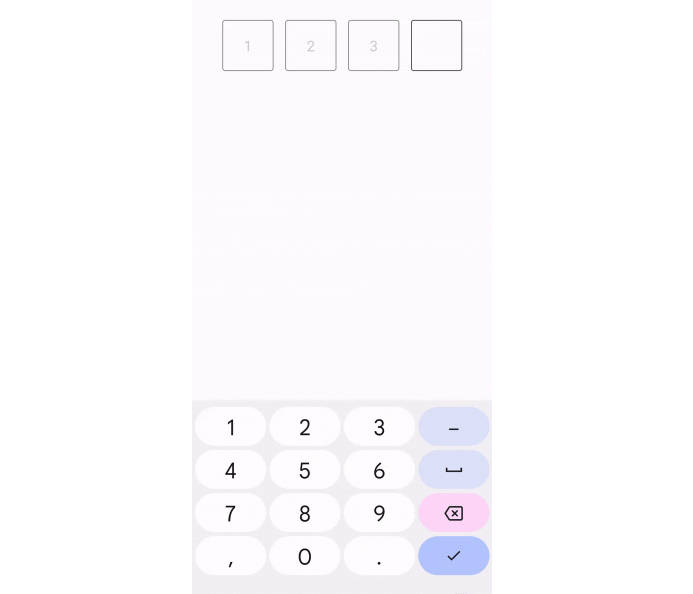
A customised EditText view serving the purpose of taking numeric One Time Password from a user. With stunning animation, and high customizability.
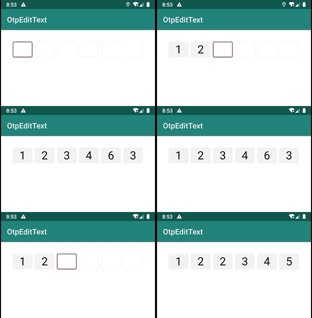
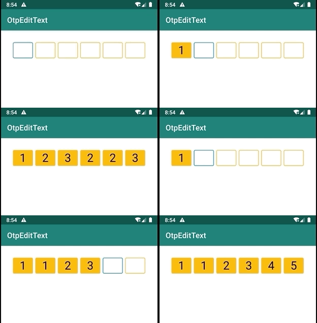
Packed with features
- Add custom character limit.
- Use your own color scheme.
- Do not allow user changing cursor position for smooth functioning.
How to integrate the library in your app?
Step 1: Add it in your root build.gradle at the end of repositories:
allprojects {
    repositories {
        maven { url "https://jitpack.io" }
    }
}
Step 2. Add the dependency
dependencies {
    implementation 'com.github.swapnil1104:OtpEditText:{current_lib_ver}'
}
Step 3. Add OtpEditText to your layout file
<com.broooapps.otpedittext2.OtpEditText
    android:layout_width="match_parent"
    android:layout_height="wrap_content"
    android:clickable="false"
    android:cursorVisible="false"
    android:digits="0123456789"
    android:inputType="number"
    android:maxLength="6"
    android:padding="8dp"
    android:textSize="30sp"
    app:oev_primary_color="@color/red"
    app:oev_secondary_color="@color/light_gray"
    />
How to customize the view.
Setting desired length for the OTP(One time password code)
To set custom length of the OtpEditText, use
android:maxLength="{your length}"
This will automatically generate the right amount of boxes for user to input the code in.
Setting primary custom color
The primary color signifies the boundary of the box that requires input from user.
To change that use,
app:oev_primary_color="@color/{your_color}"
Setting secondary custom color
The secondary color signifies the boundary of the boxes that do not require input from user.
To change that use,
app:oev_secondary_color="@color/{your_color}"
For optimum usage; Please note.
- Specify
android:textSizeaccording to your needs. - Specify
android:paddingaccording to your needs, there are no paddings drawn by default. - Specify
android:layout_heightaccording to thetextSizeyou've provided. The view will try to center the text with a vertical biasing of0.6f.

