Pager
Take a look

How about it
You know that, Google created ViewPager and ViewPager2, now there is a new shit named Compose Pager. I don’t know what’s in Google’s developer’s mind to create such a worst thing, Compose Pager missed offset limit, it means you can only show three items, but sometimes we need to write a banner with stack style, I don’t know why how we wanna do that, but the PMs want it. (Modify at 2023-09-26: My genius product manager said that he want a normal style banner, so why did he create that shit? Is he thinking with his asshole?)
But don’t worry, we have hands, yep, we have these. We can do anything we want, so there are some new shit by me here.
Import
There are only two files. Just download the files to use it.
Usage
LinearPager
LinearPager(
    data = list,// data list
    pagerSwipeState = linearPagerSwipeState,// indicator need this
    duration = 5000,// auto scroll delay
    widthPx = resources.displayMetrics.widthPixels.toFloat()// ⚠️ need a fixed width, it's very important!
) { it, index -> // `it` is the data list's item, index is list's index
    AsyncImage(
        model = it,
        contentDescription = null,
        contentScale = androidx.compose.ui.layout.ContentScale.Crop,
        modifier = Modifier
            .fillMaxWidth()
            .height(200.dp)
            .padding(10.dp)
            .clip(RoundedCornerShape(10.dp))
    )
}
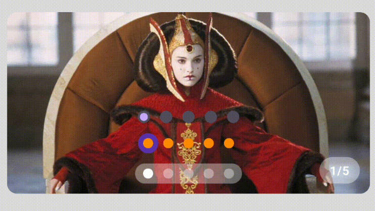
StackPager
StackPager(
    modifier = Modifier,
    data = list,
    pagerSwipeState = stackPagerSwipeState,
    stackOffsetStep = 10.dp,
    alphaStep = 0.35f,
    scaleStep = 0.05f,
    widthPx = resources.displayMetrics.widthPixels.toFloat()
) { it, index ->

    Box(
        Modifier
            .fillMaxWidth()
            .height(200.dp)
            .padding(10.dp)
            .shadow(5.dp, RoundedCornerShape(10.dp))
    ) {
        AsyncImage(
            model = it,
            contentDescription = null,
            contentScale = androidx.compose.ui.layout.ContentScale.Crop,
            modifier = Modifier
                .fillMaxSize()
                .clip(RoundedCornerShape(10.dp))
                .clickable {
                    // stack style need to check current index
                    if (stackPagerSwipeState.current == index) {
                        // ⚠️ deal click in this block
                    }
                }
        )
        Text(
            text = it,
            color = Color.White,
            fontSize = 12.sp,
            modifier = Modifier
                .padding(10.dp)
                .padding(bottom = 15.dp)
                .align(Alignment.BottomCenter)
                .background(Color(0x33000000), RoundedCornerShape(10.dp))
                .padding(horizontal = 10.dp, vertical = 5.dp)
        )
    }
}
I think there codes are enough simple, so let’s see how to create a indicator.
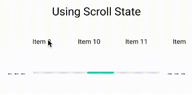
Indicator
BasicIndicator
This is the one at the bottom of stack style in the gif. It without any animation.
fun BasicIndicator(
    modifier: Modifier = Modifier,
    swipeState: PagerSwipeState,
    height: Dp = 6.dp,
    unSelectWidth: Dp = 6.dp,
    selectWidth: Dp = 18.dp,
    spaceSize: Dp = 6.dp,
    unSelectColor: Color = Color(0x66FFFFFF),
    selectColor: Color = Color.White
)
ScrollBallIndicator
This is all of the indicators except the BasicIndicator, it has smoothly animation. You can check some codes in the demo.
fun ScrollBallIndicator(
    modifier: Modifier = Modifier,
    swipeState: PagerSwipeState,
    ballSize: Dp = 10.dp,
    spaceSize: Dp = 10.dp,
    indicatorSize: Dp = 10.dp,
    unSelectColor: Color = Color(0x66FFFFFF),
    selectColor: Color = Color.White,
    underIndicator: Boolean = false,
)
Custom Indicator
You need to deal some value in PagerSwipeState
There’s a simple text indicator:
Text(
    text = "${linearPagerSwipeState.current + 1}/${linearPagerSwipeState.total}",
    modifier = Modifier
        .padding(20.dp)
        .align(Alignment.BottomEnd)
        .background(Color(0x66FFFFFF), CircleShape)
        .padding(horizontal = 10.dp, vertical = 5.dp),
    color = Color.White,
    fontSize = 12.sp,
    fontWeight = FontWeight.Bold
)
| name | description |
|---|---|
| current | current index |
| total | indicator size |
| from | animation start index |
| to | animation end index |
| fraction | the progress between from and to |
If you only want to show a indicator without animation, just need to deal current and total. If you want to make some animation, from, to and fraction will be useful.
In some indicator, maybe need to tap to change the banner’s index, you can do that with this: PagerSwipeState.snapTo or PagerSwipeState.animateTo. Like this:
val scope = rememberCoroutineScope()
Box(modifier = Modifier.clickable {
    scope.launch {
        pagerSwipeState.snapTo(index)
    }
})
Create a your own Pager
Use BasicPager, this is a basic pager, it only deal swipe, you need to deal the animation, offset and indicator or more by yourself.
In another word, LinearPager and StackPager are based on BasicPager, and they are the best examples to show how to create a pager.
About the loopLimit
If you need a loop pager, the last item will be the first item, and the first item will be the last item. So if the animation needs to be smooth, you need to set the loopLimit to you want to show over of the original data.
For example, if you have 5 items and use a style like LinearPager you need to set the loopLimit to 1. And you need to change your list to [5, 1, 2, 3, 4, 5, 1]. If you use a style like StackPager, you need to set the loopLimit to 3. And you need to change your list to [3, 4, 5, 1, 2, 3, 4, 5, 1, 2, 3]. When you swipe the page to the end(your original data list’s end), and swipe again, BasicPager will make the current back to the first, and the animation will looks smooth. If you don’t need a loop pager, just set the loopLimit to 0 and loop to false.