UIMenu Component for React Native

@react-native-menu/menu
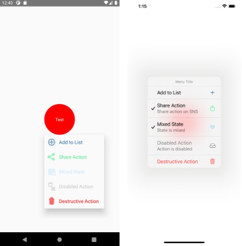
Android PopupMenu and iOS14+ UIMenu components for react-native.
Falls back to ActionSheet for versions below iOS14.
| Android | iOS 14+ | iOS 13 |
|---|---|---|
 |
 |
 |
Installation
via npm:
npm install @react-native-menu/menu
via yarn:
yarn add @react-native-menu/menu
Installing on iOS with React Native 0.63 and above
There is an issue(https://github.com/facebook/react-native/issues/29246) causing projects with this module to fail on build on React Native 0.63 and above.
This issue may be fixed in future versions of react native.
As a work around, look for lines in [YourPrject].xcodeproj under LIBRARY_SEARCH_PATHS with "\"$(TOOLCHAIN_DIR)/usr/lib/swift-5.0/$(PLATFORM_NAME)\"", and change swift-5.0 to swift-5.3.
Linking
The package is automatically linked when building the app. All you need to do is:
npx pod-install
Usage
import { MenuView } from '@react-native-menu/menu';

// ...

const App = () => {
  return (
    <View style={styles.container}>
      <MenuView
        title="Menu Title"
        onPressAction={({ nativeEvent }) => {
          console.warn(JSON.stringify(nativeEvent));
        }}
        actions={[
          {
            id: 'add',
            titleColor: '#2367A2',
            image: Platform.select({
              ios: 'plus',
              android: 'ic_menu_add',
            }),
            imageColor: '#2367A2',
            subactions: [
              {
                id: 'nested1',
                title: 'Nested action',
                titleColor: 'rgba(250,180,100,0.5)',
                subtitle: 'State is mixed',
                image: Platform.select({
                  ios: 'heart.fill',
                  android: 'ic_menu_today',
                }),
                imageColor: 'rgba(100,200,250,0.3)',
                state: 'mixed',
              },
              {
                id: 'nestedDestructive',
                title: 'Destructive Action',
                attributes: {
                  destructive: true,
                },
                image: Platform.select({
                  ios: 'trash',
                  android: 'ic_menu_delete',
                }),
              },
            ],
          },
          {
            id: 'share',
            title: 'Share Action',
            titleColor: '#46F289',
            subtitle: 'Share action on SNS',
            image: Platform.select({
              ios: 'square.and.arrow.up',
              android: 'ic_menu_share',
            }),
            imageColor: '#46F289',
            state: 'on',
          },
          {
            id: 'destructive',
            title: 'Destructive Action',
            attributes: {
              destructive: true,
            },
            image: Platform.select({
              ios: 'trash',
              android: 'ic_menu_delete',
            }),
          },
        ]}
        shouldOpenOnLongPress={true}
      >
        <View style={styles.button}>
          <Text style={styles.buttonText}>Test</Text>
        </View>
      </MenuView>
    </View>
  );
};
Reference
Props
title (iOS only)
The title of the menu.
| Type | Required |
|---|---|
| string | No |
isAnchoredToRight (Android only)
Boolean determining if menu should anchored to right or left corner of parent view.
| Type | Required |
|---|---|
| boolean | No |
shouldOpenOnLongPress
Boolean determining if menu should open after long press or on normal press
| Type | Required |
|---|---|
| boolean | No |
actions
Actions to be displayed in the menu.
| Type | Required |
|---|---|
| MenuAction[] | Yes |
MenuAction
Object representing Menu Action.
export type MenuAction = {
  /**
   * Identifier of the menu action.
   * The value set in this id will be returned when menu is selected.
   */
  id?: string;
  /**
   * The action's title.
   */
  title: string;
  /**
   * (Android only)
   * The action's title color.
   * @platform Android
   */
  titleColor?: number | ColorValue;
  /**
   * (iOS14+ only)
   * An elaborated title that explains the purpose of the action.
   * @platform iOS
   */
  subtitle?: string;
  /**
   * The attributes indicating the style of the action.
   */
  attributes?: MenuAttributes;
  /**
   * (iOS14+ only)
   * The state of the action.
   * @platform iOS
   */
  state?: MenuState;
  /**
   * (Android and iOS13+ only)
   * - The action's image.
   * - Allows icon name included in project or system (Android) resources drawables and
   * in SF Symbol (iOS)
   * @example // (iOS)
   * image="plus"
   * @example // (Android)
   * image="ic_menu_add"
   * - TODO: Allow images other than those included in SF Symbol and resources drawables
   */
  image?: string;
  /**
   * (Android and iOS13+ only)
   * - The action's image color.
   */
  imageColor?: number | ColorValue;
  /**
   * (Android and iOS14+ only)
   * - Actions to be displayed in the sub menu
   * - On Android it does not support nesting next sub menus in sub menu item
   */
  subactions?: MenuAction[];
};
MenuAttributes
The attributes indicating the style of the action.
type MenuAttributes = {
  /**
   * An attribute indicating the destructive style.
   */
  destructive?: boolean;
  /**
   * An attribute indicating the disabled style.
   */
  disabled?: boolean;
  /**
   * An attribute indicating the hidden style.
   */
  hidden?: boolean;
};
MenuState
The state of the action.
/**
 * The state of the action.
 * - off: A constant indicating the menu element is in the “off” state.
 * - on: A constant indicating the menu element is in the “on” state.
 * - mixed: A constant indicating the menu element is in the “mixed” state.
 */
type MenuState = 'off' | 'on' | 'mixed';
onPressAction
Callback function that will be called when selecting a menu item.
It will contain id of the given action.
| Type | Required |
|---|---|
| ({nativeEvent}) => void | No |
Contributing
See the contributing guide to learn how to contribute to the repository and the development workflow.
License
MIT