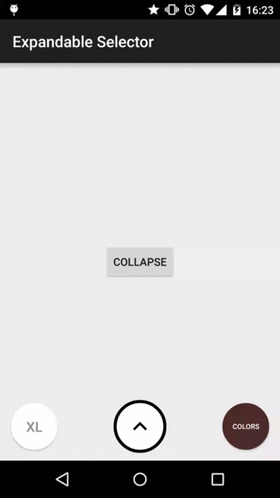
ExpandableSelector
ExpandableSelector is an Android library created to show a list of Button/ImageButton widgets inside a animated container which can be collapsed or expanded.
Usage
To use ExpandableSelector in your application you have to follow this steps:
- 1 - Add
ExpandableSelectorto your layout:
 <com.karumi.expandableselector.ExpandableSelector
      android:id="@+id/es_sizes"
      android:layout_width="wrap_content"
      android:layout_height="wrap_content"/>
- 2 - During your Activity/Fragment creation lifecycle create a list of
ExpandableIteminstances and configure them to be used inside yourExpandableSelectorwidget:
private void initializeSizesExpandableSelector() {
    ExpandableSelector sizesExpandableSelector = (ExpandableSelector) findViewById(R.id.es_sizes);
    List<ExpandableItem> expandableItems = new ArrayList<ExpandableItem>();
    expandableItems.add(new ExpandableItem("XL"));
    expandableItems.add(new ExpandableItem("L"));
    expandableItems.add(new ExpandableItem("M"));
    expandableItems.add(new ExpandableItem("S"));
    sizesExpandableSelector.showExpandableItems(expandableItems);
}
- 3 - To be able to listen the animation events configure a
ExpandableSelectorListenerinstance:
private void configureExpandableSelectorListener() {

    sizesExpandableSelector.setExpandableSelectorListener(new ExpandableSelectorListener() {
          @Override public void onCollapse() {
            //Do something here
          }

          @Override public void onExpand() {
            //Do something here
          }

          @Override public void onCollapsed() {
            //Do something here
          }

          @Override public void onExpanded() {
            //Do something here
          }
        });
}
- 4 - To be able to listen the click events configure a
OnExpandableItemClickListenerinstance:
private void configureExpandableSelectorClickListener() {

    sizesExpandableSelector.setOnExpandableItemClickListener(new OnExpandableItemClickListener() {
          @Override public void onExpandableItemClickListener(int index, View view) {
             //Do something here
          }
        });
}
Customization
You can easily customize the appearance of your ExpandableItem instances. Just asign a value to expandableItemSyle attribute in your theme and make it reference a custom style.
<style name="AppTheme" parent="Theme.AppCompat.Light.DarkActionBar">
    <item name="expandableItemStyle">@style/ExpandableItemStyle</item>
</style>

<style name="ExpandableItemStyle">
    <item name="android:layout_height">@dimen/item_size</item>
    <item name="android:layout_width">@dimen/item_size</item>
    <item name="android:background">@drawable/bg_item_with_title</item>
    <item name="android:layout_margin">@dimen/item_margin</item>
    <item name="android:textColor">@color/gray</item>
    <item name="android:textSize">@dimen/item_text_size</item>
</style>
Remember that declaring a ExpandableItemStyle as described before with the layout height and width is mandatory to avoid inflation errors.
The resources you can show in the Button/ImageButton widgets automatically added to ExpandableSelector are:
- Background resource identifier configured as Button/ImageButton background.
- Resource identifier configured as ImageButton image source.
- Title configured as Button text.
All this information will be provided to the ExpandableSelector inside a List<ExpandableItem> object created by the library user.
Some extra configuration parameters can be provided from the XML like styleable attributes:
  <com.karumi.expandableselector.ExpandableSelector
      xmlns:expandable_selector="http://schemas.android.com/apk/res-auto"
      android:layout_width="wrap_content"
      android:layout_height="wrap_content"
      expandable_selector:hide_background_if_collapsed="true"
      expandable_selector:hide_first_item_on_collapse="true"
      expandable_selector:expand_interpolator="@android:anim/accelerate_interpolator"
      expandable_selector:collapse_interpolator="@android:anim/decelerate_interpolator"
      expandable_selector:container_interpolator="@android:anim/accelerate_decelerate_interpolator"
      expandable_selector:animation_duration="100">
The attributes you can configure are:
- expandable_selector:hide_background_if_collapsed: Changes the background associated to the
ExpandableSelectorwidget to a transparent one while the widget is collapsed. - expandable_selector:hide_first_item_on_collapse: Changes the first item visibility to View.INVISIBLE when the
ExpandableSelectoris collapsed. - expandable_selector:expand_interpolator: Changes the interpolator used in the expand animation (applies to the items), you can use an interpolator available in the platform, or create your own.
- expandable_selector:collapse_interpolator: Changes the interpolator used in the collapse animation (applies to the items).
- expandable_selector:container_interpolator: Changes the interpolator used in the expand & collapse animation (applies to the container)
- expandable_selector:animation_duration: Changes the animation duration in milliseconds to the one indicated.
Add it to your project
Add ExpandableSelector dependency to your build.gradle file
dependencies{
    compile 'com.karumi:expandableselector:1.0.0'
}
or to your pom.xml if you are using Maven instead of Gradle
<dependency>
    <groupId>com.karumi</groupId>
    <artifactId>expandableselector</artifactId>
    <version>1.0.0</version>
    <type>aar</type>
</dependency>