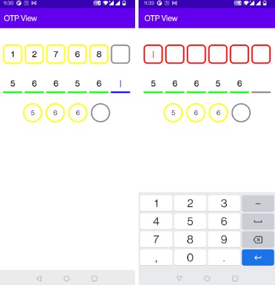
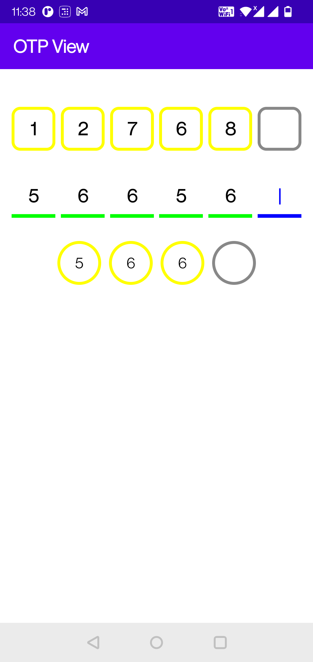
OTPView - A highly customisable and can be used to show OTP view with different length and shapes

OTPView
OTPView is a highly costumizable OTP view made in the Jetpack compose UI.
Usage:
CircleOtpView is a sample composable that calls the OtpView which actually draws the view.
@Composable
fun CircleOtpView() {
    var otpStr by remember {
        mutableStateOf("")
    }
    var isError by remember {
        mutableStateOf(false)
    }
    OtpView(
        modifier = Modifier.width(240.dp),
        otpStr = otpStr,
        isError = isError,
        shape = PinShape.CircleShape,
        numberOfFields = 4
    ) { otp ->
        otpStr = otp
        if (otpStr.length == 4) {
            // Completely filled
            isError = otpStr != "1234"
            if (isError) {
                otpStr = ""
            }
        }

        if (isError && otpStr.isNotEmpty()) {
            isError = false
        }
    }
}
PinShape
Different shapes can be created using PinShape, which is an interface and contains only one method drawShape(size: Size): Path. Implementor class has to implement this method and return a Path which needs to be drawn with the given size in the method param.
class LineShape(private val strokeWidth: Float): PinShape {
      override fun drawShape(size: Size): Path {
         return Path().apply {
             reset()
             addRect(Rect(0f, size.height - (strokeWidth / 2), size.width, size.height))
             close()
         }
      }
}
PinShape is passed as a parameter in the OtpView composable and it is used in the PinField Modifier’s drawBehind {}.
@Composable
fun PinField(
    modifier = Modifier,
    shape: PinShape,
    .
    .
    .
) {
    Box(
        modifier = modifier
            .width(width)
            .fillMaxHeight()
            .drawBehind {
                drawPath(
                    path = shape.drawShape(this.size),
                    .
                    .
                )
            }
            .clickable {
                onClick(index)
            },
    ) {
        ....
    }
}
Courtesy:
-
Idea of using single TextField and displaying different view for the pins: https://github.com/ch8n/Compose-OtpView
-
Custom shapes https://juliensalvi.medium.com/custom-shape-with-jetpack-compose-1cb48a991d42

