Modal bottom sheet dialog based on the Material Guidelines
ModalBottomSheetDialogFragment
Modal bottom sheet dialog based on the Material Guidelines.
Usage
ModalBottomSheetDialogFragments are typically inflated via a menu item resource. The menu item resource defines the title, icon, and ID is of each Option. The menu item resource might looks something like this:
<?xml version="1.0" encoding="utf-8"?>
<menu xmlns:android="http://schemas.android.com/apk/res/android">

    <item
        android:id="@+id/action_favorite"
        android:icon="@drawable/ic_favorite_black_24dp"
        android:title="Favorite" />

    <item
        android:id="@+id/action_share"
        android:icon="@drawable/ic_share_black_24dp"
        android:title="Share" />

    <item
        android:id="@+id/action_edit"
        android:icon="@drawable/ic_edit_black_24dp"
        android:title="Edit" />

</menu>
Use the builder to create and show the bottom sheet dialog:
ModalBottomSheetDialogFragment.Builder()
    .add(R.menu.options)
    .show(supportFragmentManager, "options")
Make sure that your activity or fragment implements ModalBottomSheetDialogFragment.Listener. For example:
override fun onModalOptionSelected(tag: String?, option: Option) {
    Snackbar.make(root, "Selected option ${option.title} from fragment with tag $tag", Snackbar.LENGTH_SHORT)
            .show()
}
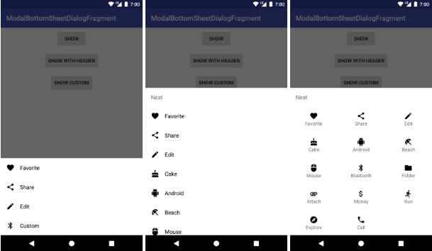
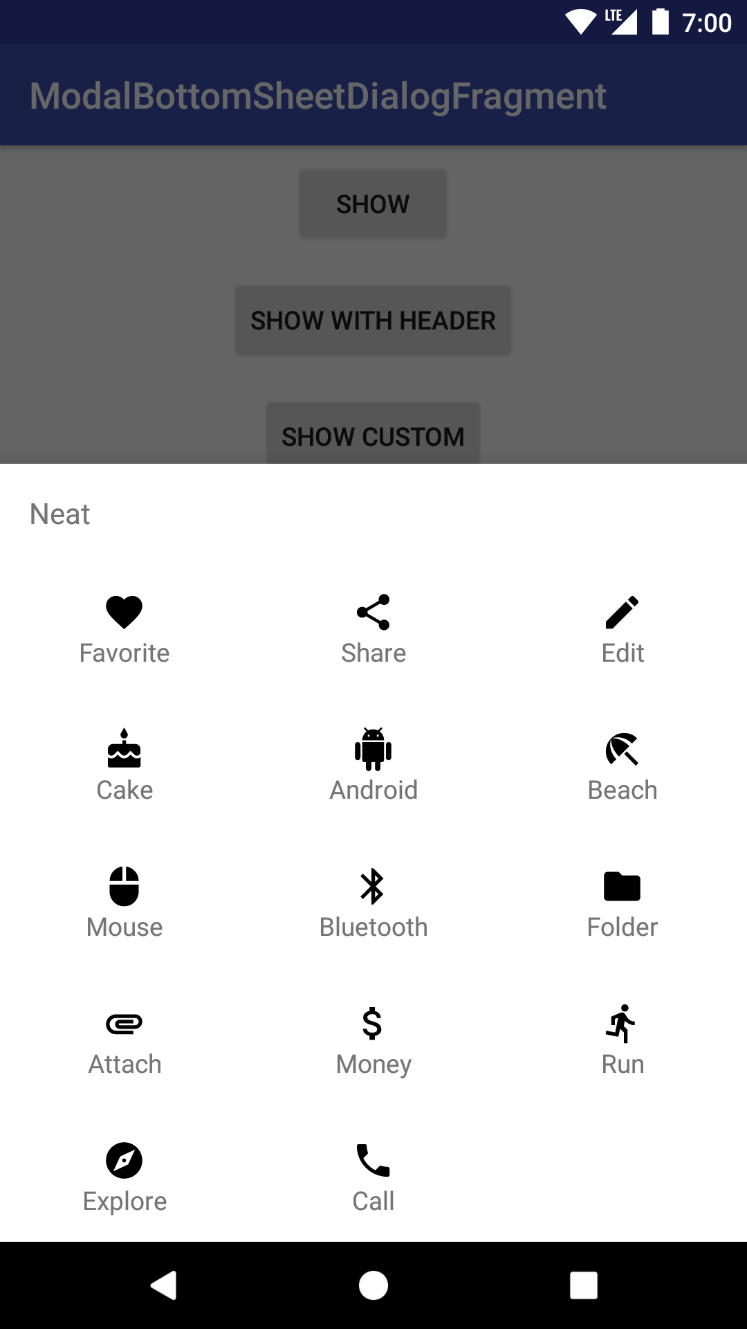
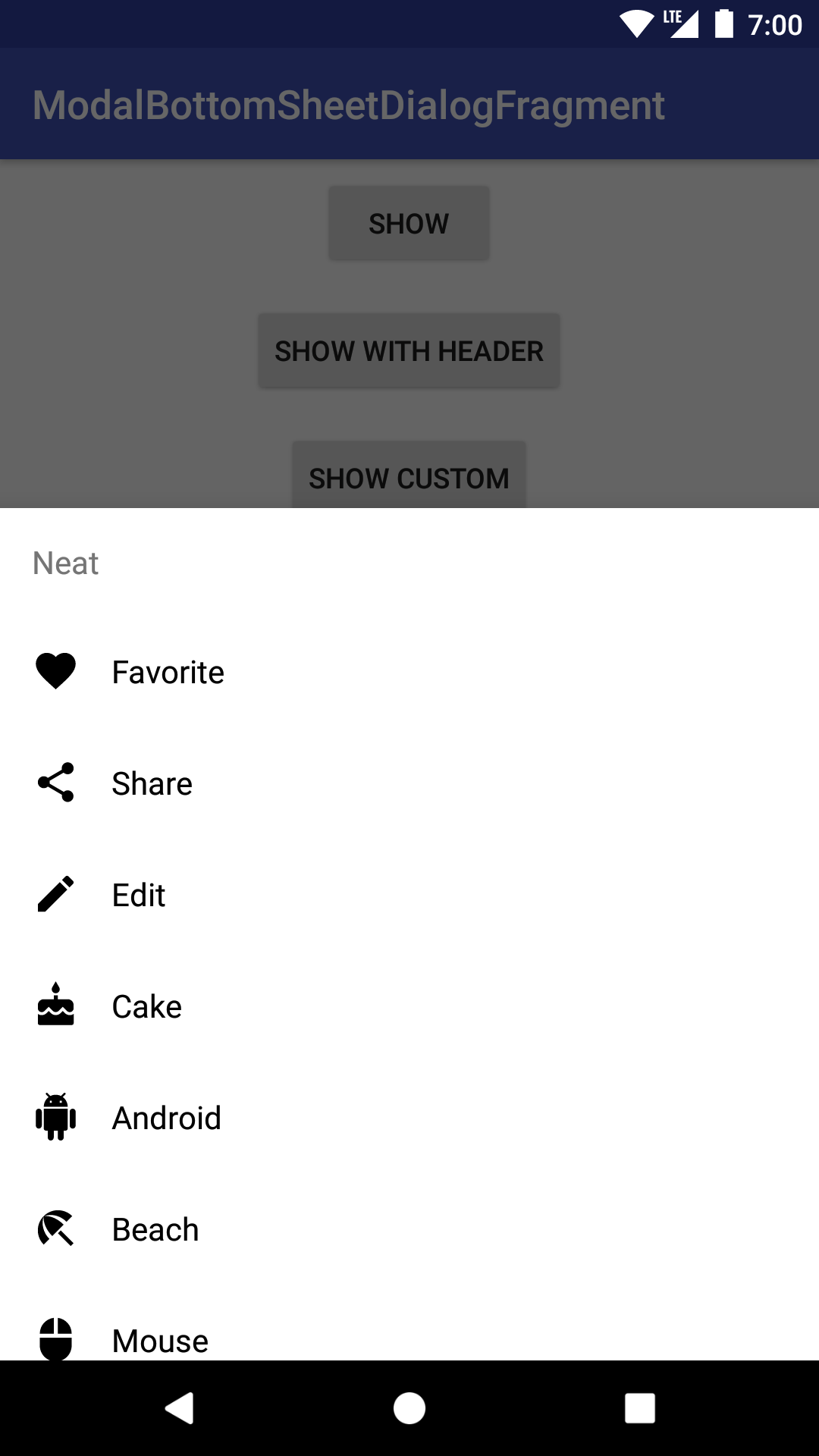
You can also customize things to your liking:
ModalBottomSheetDialogFragment.Builder()
    .add(R.menu.option_lots)
    //custom option, without needing menu XML
    .add(OptionRequest(123, "Custom", R.drawable.ic_bluetooth_black_24dp))
    .layout(R.layout.item_custom)
    .header("Neat")
    .columns(3)
    .show(supportFragmentManager, "custom")
See the sample app for more.