JetChart the Jetpack Compose charts library

JetChart
A Jetpack Compose library for creating beautiful and interactive charts.
The library supports a wide variety of chart types, including bar charts, line charts…
Charts can be customized to match your app’s style, and they can be animated to provide a more engaging user experience.
Charts can be created in a declarative way, which makes it easy to update them as your data changes.
The library is open source, and it is available on GitHub.
Key features:
- Supports a wide variety of chart types
- Easy to use
- Declarative API
- Open source
- Visualize data in a clear and concise way
- Engage users with interactive charts
- Make your app more visually appealing
Use cases:
- Financial apps
- Analytics apps
- Educational apps
- Any app that needs to visualize data
Gradle setup
- Add the JitPack repository to your build file
allprojects {
    repositories {
        ...
        maven { url 'https://jitpack.io' }
    }
}
- Add the dependency
dependencies {
    implementation 'com.github.fracassi-marco:JetChart:1.1.0'
}
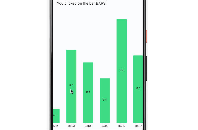
Bar Chart

Features
You can:
- scroll horizontally
- show values inside or above the bar
- define for each bar an action on the tap event
- customize colors and sizes
- define custom x-axis labels
- show or hide y-axis values
- animate the drawing
Example
@Composable
fun BarChartComposable(text: MutableState<String>) {
    val numberOfBars = 8
    val width = numberOfBars * 80
    BarChart(chars = Bars(
        bars = (1..numberOfBars).map {
            Bar(label = "BAR$it", value = Random.nextFloat(), color = JetGreen) {
                    bar -> text.value = "You clicked on the bar ${bar.label}!"
            }
        }),
        modifier = Modifier.horizontalScroll(rememberScrollState()).width(width.dp).height(500.dp),
        animation = fadeInAnimation(3000),
        xAxisDrawer = BarXAxisDrawer(),
        yAxisDrawer = BarYAxisWithValueDrawer(),
        labelDrawer = SimpleLabelDrawer(),
        valueDrawer = SimpleValueDrawer(drawLocation = Inside)
    )
}
Line Chart
Features
You can:
- scroll horizontally
- draw multiple lines
- chose how to draw points (none, filled circle or empty circle)
- show lines shading (transparent, solid or gradient)
- define for each point an action on the tap event (TODO)
- customize colors and sizes
- define custom x-axis labels
- show or hide y-axis values
- animate the drawing
Example
@Composable
fun LineChartComposable() {
    LineChart(lines = listOf(
        Line(points = points(10), lineDrawer = SolidLineDrawer(thickness = 8.dp, color = Blue)),
        Line(points = points(15), lineDrawer = SolidLineDrawer(thickness = 8.dp, color = Red))),
        modifier = Modifier
            .horizontalScroll(rememberScrollState())
            .width(1000.dp)
            .height(500.dp),
        animation = fadeInAnimation(3000),
        pointDrawer = FilledPointDrawer(),
        xAxisDrawer = LineXAxisDrawer(),
        yAxisDrawer = LineYAxisWithValueDrawer(),
        horizontalOffsetPercentage = 1f,
        lineShader = GradientLineShader(listOf(JetGreen, Transparent))
    )
}

@Composable
private fun points(count: Int) = (1..count).map { Point(Random.nextFloat(), "Point$it") }