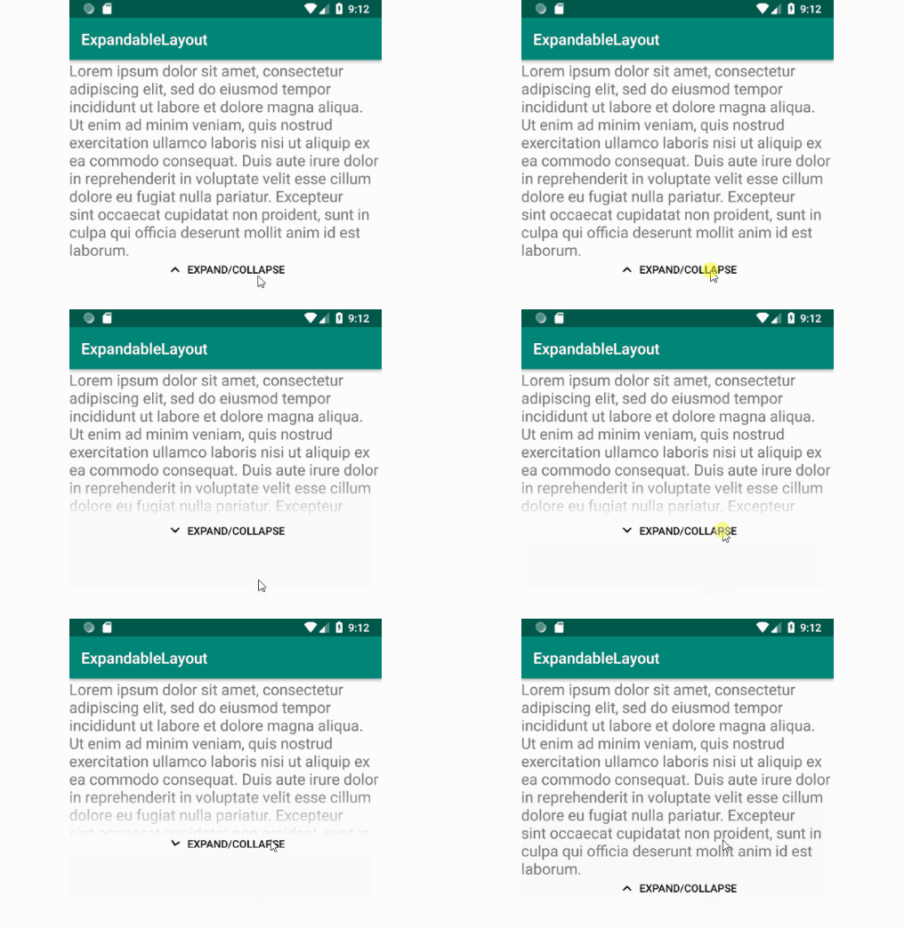
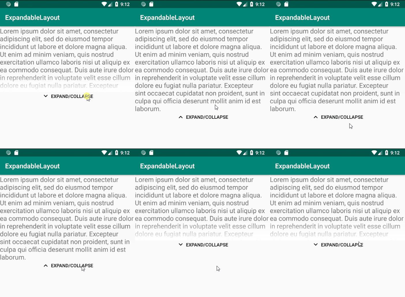
ExpandableLayout use ConstraintSet for animate the state changing

ExpandableLayout
ExpandableLayout use ConstraintSet for animate the state changing.
An ExpandableLayout for Android (Api 16+) written in Kotlin. Use ConstraintSet for animate changed. The library also handles configuration changes, so that the view remains expanded/collapsed on configuration change.

Getting Started
- Add it in your root build.gradle at the end of repositories:
allprojects {
   repositories {
      ...
      maven { url 'https://jitpack.io' }
   }
}
- Add the dependency:
dependencies {
   implementation 'com.github.josinSbazin:android_ExpandableLayout:0.5'
}
Usage
- Define the
el_collapsedHeightxml attribute (setCollapsedHeight(int height)method in Java orcollapsedHeightproperty in Kotlin) to set the height of view in collapsed state. - Provide unique
idso that library could restore its state after configuration change.
Then use ExpandableLayout with any other nested views
Xml snippet:
<ru.rhanza.constraintexpandablelayout.ExpandableLayout
        xmlns:android="http://schemas.android.com/apk/res/android"
        xmlns:tools="http://schemas.android.com/tools"
        xmlns:app="http://schemas.android.com/apk/res-auto"
        android:id="@+id/content"
        android:layout_width="match_parent"
        android:layout_height="match_parent"
        app:el_animationDuration="100"
        app:el_initialState="collapsed"
        app:el_collapsedHeight="200dp"
        app:el_moreText="Expand/Collapse"
        app:el_shadowHeight="60dp"
        app:el_showShadow="true"
        app:el_showButton="true"
        app:el_moreColor="@android:color/black"
        >

   ...

</ru.rhanza.constraintexpandablelayout.ExpandableLayout>
You can setup this layout programmarically:
override fun onCreate(savedInstanceState: Bundle?) {
        super.onCreate(savedInstanceState)
        setContentView(R.layout.activity_programmatically_sample)
        //You can setup ConstraintExpandableLayout programmatically
        content.showButton = false
        content.showShadow = true
        content.animationDuration = 300
        content.collapsedHeight = 120
        button.setOnClickListener { content.toggle() }
    }
Available xml attributes:
        app:el_collapsedHeight="200dp"
        app:el_showShadow="true"
        app:el_shadowHeight="60dp"
        app:el_showButton="true"
        app:el_moreText="Expand/Collapse"
        app:el_animationDuration="100"
        app:el_moreColor="@android:color/black
        app:el_initialState="collapsed" --available states (collapsed, expanded, statical)
        app:el_animationSceneRoot="@+id/animationParentViewId"
If the maximum height of the nested view is less than the collapsed height, then the view will take a static state.
If you want to change the state at runtime (for example, filling content after loading), you can you can use the
collapse / expand method with the parameter forced - true.
override fun onCreate(savedInstanceState: Bundle?) {
        super.onCreate(savedInstanceState)
        //You can setup ConstraintExpandableLayout in xml
        setContentView(R.layout.activity_xml_sample)

        text.postDelayed({
            text.text =
                    "Lorem ipsum dolor sit amet, consectetur adipiscing elit, sed do eiusmod tempor incididunt ut labore et dolore magna aliqua. Ut enim ad minim veniam, quis nostrud exercitation ullamco laboris nisi ut aliquip ex ea commodo consequat. Duis aute irure dolor in reprehenderit in voluptate velit esse cillum dolore eu fugiat nulla pariatur. Excepteur sint occaecat cupidatat non proident, sunt in culpa qui officia deserunt mollit anim id est laborum."
            content.invalidateState(State.Collapsed)
        }, 100)
    }
Available public methods and properties:
-
state: State - Current
Stateof thisExpandableLayout. Read-only property.State.Staticalby default. -
onStateChangeListener: ((oldState: State, newState: State) -> Unit)? - Invoke when
Statechanged. -
collapsedHeight: Int - Collapsed height in pixels of view. WARNING! Don't set [collapsedHeight] less, then maximum height of wrapped view.
-
shadowHeight: Int - Height of shadow in pixels when layout is collapsed.
-
showShadow: Boolean - If this parameter is true - show shadow in collapsed 'State'.
-
showButton: Boolean - Show default collapse/expand button. Use if you want make custom button.
-
moreText: CharSequence - Text showing on more button.
-
animationDuration: Int - Duration of animation of collapse/expand. In milliseconds.
-
@ColorInt moreColor: Int - Color of more button (text and arrow).
-
animationSceneRootId: Int - Animation scene root id for transition. Use for animate container for this view. Default is self
-
fun toggle(withAnimation: Boolean = true) - Toggle
ExpandableLayoutstate. Ignore ifState.Statical.
withAnimation - should it toggle with animation or instantaneously. true by default.
- fun collapse(withAnimation: Boolean = true, forced: Boolean = false) - Collapse
ExpandableLayout. Ignore ifState.Statical.
withAnimation - should it collapse with animation or instantaneously. true by default.
forced - should it collapse in any state forced. false by default.
- fun expand(withAnimation: Boolean = true, forced: Boolean = false) - Expand
ExpandableLayout. Ignore ifState.Statical.
withAnimation - should it expand with animation or instantaneously. true by default.
forced - should it expand in any state forced. false by default.