Jetpack Compose Colorful Customizable Sliders
Colorful sliders that can have Solid or Gradient colors for thumb or track which can have thumb and track with varying sizes, borders with solid or gradient colors. And Sliders with emojis, or custom Composables like Icon.
| Dimensions | Properties | Slider with Icon | Slider with Label | Gradient |
|---|---|---|---|---|
 |
 |
 |
 |
 |
ColorfulSlider
Sliders that can use Color or gradient for track, thumb, or tick colors with custom thumb and track heights.
@Composable
fun ColorfulSlider(
    value: Float,
    onValueChange: (Float) -> Unit,
    modifier: Modifier = Modifier,
    enabled: Boolean = true,
    valueRange: ClosedFloatingPointRange<Float> = 0f..1f,
    steps: Int = 0,
    onValueChangeFinished: (() -> Unit)? = null,
    trackHeight: Dp = TrackHeight,
    thumbRadius: Dp = ThumbRadius,
    colors: MaterialSliderColors = MaterialSliderDefaults.defaultColors(),
    borderStroke: BorderStroke? = null,
    drawInactiveTrack: Boolean = true,
    coerceThumbInTrack: Boolean = false
)
And one that returns thumb position as Offset
fun ColorfulSlider(
    value: Float,
    onValueChange: (Float, Offset) -> Unit,
    modifier: Modifier = Modifier,
    enabled: Boolean = true,
    valueRange: ClosedFloatingPointRange<Float> = 0f..1f,
    steps: Int = 0,
    onValueChangeFinished: (() -> Unit)? = null,
    trackHeight: Dp = TrackHeight,
    thumbRadius: Dp = ThumbRadius,
    colors: MaterialSliderColors = MaterialSliderDefaults.defaultColors(),
    borderStroke: BorderStroke? = null,
    drawInactiveTrack: Boolean = true,
    coerceThumbInTrack: Boolean = false
)
- value current value of the Slider. If outside of valueRange provided, value will be coerced to this range.
- onValueChange lambda that returns value, position of thumb as Offset, vertical center is stored in y.
- modifier modifiers for the Slider layout
- enabled whether or not component is enabled and can be interacted with or not
- valueRange range of values that Slider value can take. Passed value will be coerced to this range
- steps if greater than 0, specifies the amounts of discrete values, evenly distributed between across the whole value range. If 0, slider will behave as a continuous slider and allow to choose any value from the range specified. Must not be negative.
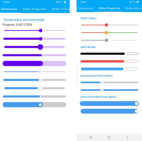
- trackHeight height of the track that will be drawn on Canvas. half of trackHeight is used as stroke width.
- thumbRadius radius of thumb of the the slider
- colors MaterialSliderColors** that will be used to determine the color of the Slider parts in different state. See MaterialSliderDefaults.defaultColors, ** MaterialSliderDefaults.customColors** or other functions to customize.
- borderStroke draws border around the track with given width in dp.
- drawInactiveTrack flag to draw InActive track between active progress and track end.
- coerceThumbInTrack when set to true track’s start position is matched to thumbs left on start and thumbs right at the end of the track. Use this when trackHeight is bigger than ** thumbRadius**.
Usage
ColorfulSlider(
    value = progress2,
    thumbRadius = 10.dp,
    trackHeight = 10.dp,
    onValueChange = { it ->
        progress2 = it
    },
    colors = MaterialSliderDefaults.materialColors(
        inactiveTrackColor = SliderBrushColor(color = Color.Transparent),
        activeTrackColor = SliderBrushColor(
            brush = sunriseGradient(),
        )
    ),
    borderStroke = BorderStroke(2.dp, sunriseGradient())
)
SliderBrushColor is a data class which can be used to set color or brush for any color property
/**
 * Data class that contains color or/and brush property for drawing track section of
 * [ColorfulSlider]
 */
data class SliderBrushColor(
    val color: Color = Color.Unspecified,
    val brush: Brush? = null
) {
    /**
     * [Brush] that is not **null** [brush] property or [SolidColor] that is not nullable and
     * contains [color] property as [SolidColor.value]
     */
    val activeBrush: Brush
        get() = brush ?: solidColor

    /**
     * [SolidColor] is a [Brush] that
     * wraps [color] property that is used for [activeBrush] if [brush] property is **null**
     */
    val solidColor = SolidColor(color)
}
SliderWithLabel
Sliders that can move a label above the Slider and display progress
fun SliderWithLabel(
    value: Float,
    onValueChange: (Float) -> Unit,
    modifier: Modifier = Modifier,
    enabled: Boolean = true,
    valueRange: ClosedFloatingPointRange<Float> = 0f..1f,
    steps: Int = 0,
    onValueChangeFinished: (() -> Unit)? = null,
    trackHeight: Dp = TrackHeight,
    thumbRadius: Dp = ThumbRadius,
    colors: MaterialSliderColors = MaterialSliderDefaults.defaultColors(),
    borderStroke: BorderStroke? = null,
    drawInactiveTrack: Boolean = true,
    coerceThumbInTrack: Boolean = false,
    labelPosition: LabelPosition = LabelPosition.Top,
    yOffset: Dp = 0.dp,
    label: @Composable () -> Unit = {}
)
Usage
SliderWithLabel(
    value = labelProgress,
    onValueChange = {
        labelProgress = it
    },
    thumbRadius = 10.dp,
    trackHeight = 10.dp,
    valueRange = 0f..100f,
    colors = MaterialSliderDefaults.materialColors(),
    labelPosition = LabelPosition.Bottom,
    label = {
        Text(
            text = "$${labelProgress.roundToInt()}",
            modifier = Modifier
                .shadow(1.dp, shape = CircleShape)
                .background(Brown400, shape = CircleShape)
                .padding(5.dp),
            color = Color.White
        )
    }
)
ColorfulIconSlider
Sliders that can use any Composable for thumb and use Color or gradient for track, thumb, or tick colors with custom thumb and track heights.
fun ColorfulIconSlider(
    modifier: Modifier = Modifier,
    value: Float,
    onValueChange: (Float, Offset) -> Unit,
    enabled: Boolean = true,
    valueRange: ClosedFloatingPointRange<Float> = 0f..1f,
    steps: Int = 0,
    onValueChangeFinished: (() -> Unit)? = null,
    trackHeight: Dp = TrackHeight,
    colors: MaterialSliderColors = MaterialSliderDefaults.defaultColors(),
    borderStroke: BorderStroke? = null,
    drawInactiveTrack: Boolean = true,
    coerceThumbInTrack: Boolean = false,
    thumb: @Composable () -> Unit
)
Usage
ColorfulIconSlider(
    value = progress,
    onValueChange = { value, offset ->
        progress = value
    },
    trackHeight = 14.dp,
    colors = MaterialSliderDefaults.materialColors(
        activeTrackColor = SliderBrushColor(color = Blue400),
        inactiveTrackColor = SliderBrushColor(color = Color.Transparent)
    ),
    borderStroke = BorderStroke(1.dp, Blue400)
) {
    Text(text = "?", fontSize = 40.sp, color = Color.Black)
}
or
ColorfulIconSlider(
    value = progress,
    onValueChange = { value, offset ->
        progress = value
    },
    trackHeight = 10.dp,
    colors = MaterialSliderDefaults.materialColors(
        inactiveTrackColor = SliderBrushColor(color = Color.Transparent),
        activeTrackColor = SliderBrushColor(
            brush = instaGradient(),
        )
    ),
    borderStroke = BorderStroke(2.dp, instaGradient())
) {
    Image(
        painter = painterResource(id = R.drawable.stf),
        contentDescription = null,
        modifier = Modifier.size(40.dp)
    )
}
}