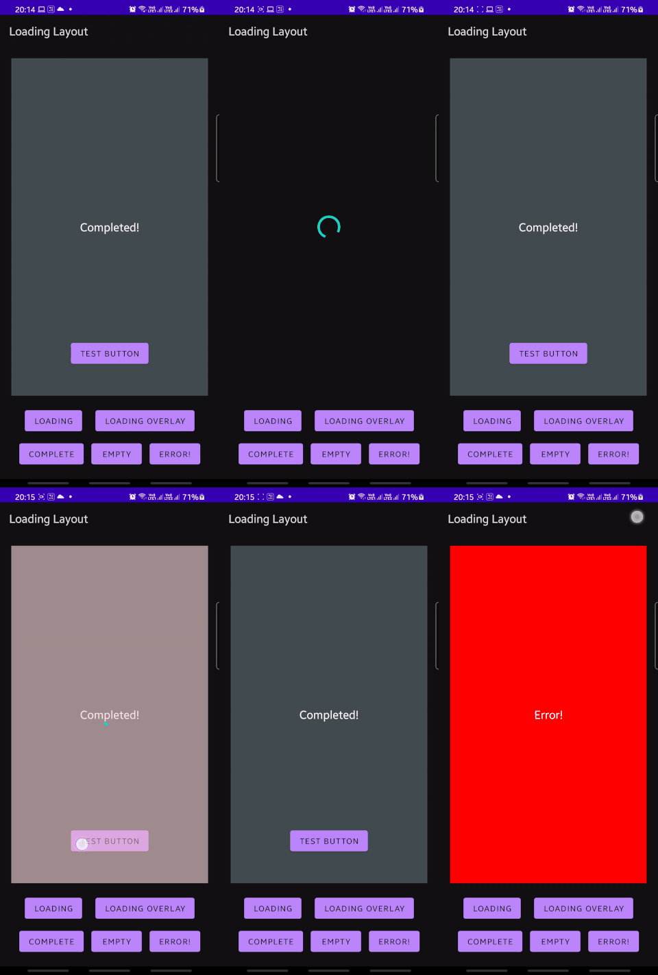
A wrapper view for your layout's different loading states

Loading Layout for Android
Loading layout is a container view that manages easy switching between loading, completed and other states of your screen with a single line. It takes away the boilerplate of setting view.setVisibility on all your various views when the state of your screen transitions between loading/loading overlay/ completed/error/empty states.

Usage
- Add it to your XML layout and add in your various layouts as direct children of
LoadingLayout. - Make sure to add in
android:tagto your elements corresponding to what you'd like them to represent:
| Layout type | android:tag |
|---|---|
| Complete | @string/ll_complete |
| Loading | @string/ll_loading |
| Empty (optional view) | @string/ll_empty |
| Error (optional view) | @string/ll_error |
Your layout should end up looking something like this:
<com.valartech.loadinglayout.LoadingLayout
        android:layout_width="match_parent"
        android:layout_height="match_parent"
        >

        <!--  Empty      -->
        <TextView
            android:tag="@string/ll_empty"
            ...
            />

        <!--   Loading     -->
        <ProgressBar
            android:layout_width="wrap_content"
            android:layout_height="wrap_content"
            android:layout_gravity="center"
            android:tag="@string/ll_loading" />

        <!--   Completed     -->
        <FrameLayout
            android:layout_width="match_parent"
            android:layout_height="match_parent"
            android:tag="@string/ll_complete">
          ...
        </FrameLayout>

        <!--    Error    -->
        <TextView
            android:layout_width="match_parent"
            android:layout_height="match_parent"
            android:tag="@string/ll_error"
            android:text="@string/error"
            />
    </com.valartech.loadinglayout.LoadingLayout>
-
And now chunks of code like this:
loadingView?.visibility = View.VISIBLE
completeView?.visibility = View.GONE
emptyView?.visibility = View.GONE
errorView?.visibility = View.GONE
can be replaced by loadingLayout.setState(LOADING)
Adding to your project
//in your project-level build.gradle
allprojects {
    repositories { //not under buildscript
        maven { url "https://jitpack.io" }
    }
}

//in your app module's build.gradle
dependencies {
    implementation "com.valartech:loading-layout:${version}"
}
Custom XML attributes
| Attribute | Description |
|---|---|
| default_state | Initial state of the view. Defaults to complete. |
| overlay_tint | Colour of the overlay tint. Defaults to 50% transparent black. |
| cross_fade_success | Enable cross-fade animation when transitioning loading -> complete. Defaults to true |
Tips
- You're free to use a single view (like a
ProgressBar) or a container of views(like aConstraintLayout) as a child of theLoadingLayout. - The
LOADING_OVERLAYis a special state that shows theloadingstate over thecompletedstate, with a tint applied over it. It also prevents button clicks from reaching thecompletedlayout. - Use
tools:default_stateto quickly check how different view states would look within your layout.
Caveat
This library does add in an extra view into your layout hierarchy, and would thus cause a slight hit in performance. We have not seen this be a noticeable issue in our apps even on complex views, but use as per your discretion on deeply nested layouts.