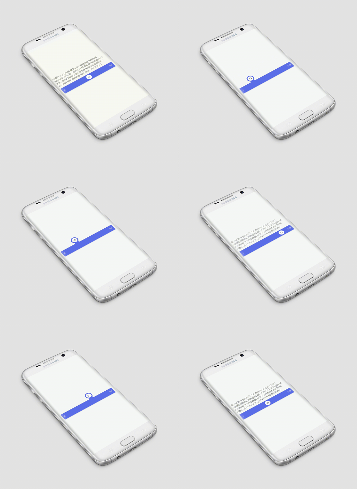
A slider widget with a popup bubble displaying the precise value selected

Fluid Slider for Android
A slider widget with a popup bubble displaying the precise value selected. Android library made by @Ramotion

Looking for developers for your project?
This project is maintained by Ramotion, Inc. We specialize in the designing and coding of custom UI for Mobile Apps and Websites.
Requirements
- Android 4.1 Jelly Bean (API lvl 16) or greater
- Your favorite IDE
Installation
Just download the package from here and add it to your project classpath, or just use the maven repo:
Gradle:
compile 'com.ramotion.fluidslider:fluid-slider:0.1.1'
SBT:
libraryDependencies += "com.ramotion.fluidslider" % "fluid-slider" % "0.1.1"
Maven:
<dependency>
  <groupId>com.ramotion.fluidslider</groupId>
  <artifactId>fluid-slider</artifactId>
  <version>0.1.1</version>
  <type>aar</type>
</dependency>
Basic usage
Place the FluidSlider in your layout.
To track the current position of the slider, set the positionListener, as shown below:
val slider = findViewById<FluidSlider>(R.id.fluidSlider)
slider.positionListener = { p -> Log.d("MainActivity", "current position is: $p" )}
You can also track the beginning and completion of the movement of the slider, using the following properties:
beginTrackingListener andendTrackingListener. Example below:
slider.beginTrackingListener = { /* action on slider touched */ }
slider.endTrackingListener = { /* action on slider released */ }
Here is simple example, how to change FluidSlider range.
val max = 45
val min = 10
val total = max - min

val slider = findViewById<FluidSlider>(R.id.fluidSlider)
slider.positionListener = { pos -> slider.bubbleText = "${min + (total  * pos).toInt()}" }
slider.position = 0.3f
slider.startText ="$min"
slider.endText = "$max"
Here are the attributes you can specify through XML or related setters:
bar_color- Color of slider.bubble_color- Color of circle "bubble" inside bar.bar_text_color- Color ofstartandendtexts of slider.bubble_text_color- Color of text inside "bubble".start_text- Start (left) text of slider.end_text- End (right) text of slider.text_size- Text size.duration- Duration of "bubble" rise in milliseconds.initial_position- Initial positon of "bubble" in range form0.0to1.0.size- Height of slider. Can besmall(40dp) andnormal(56dp).