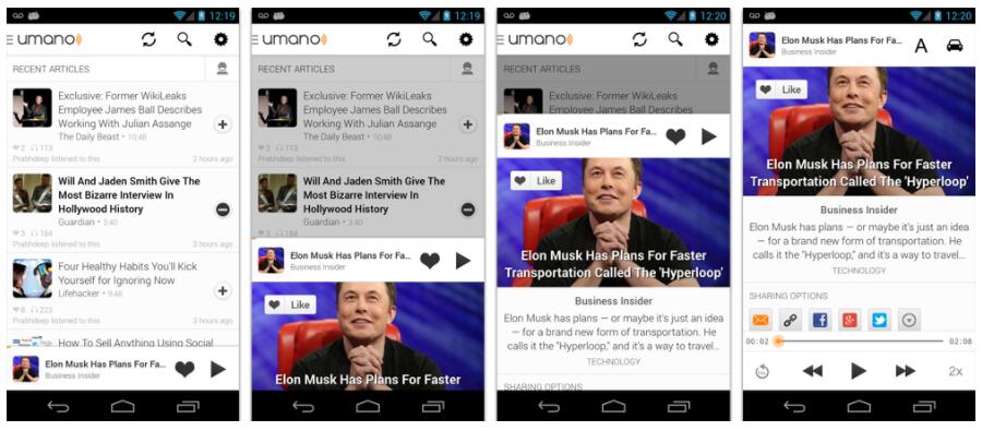
A simple way to add a draggable sliding up panelto your app

Android Sliding Up Panel
This library provides a simple way to add a draggable sliding up panel (popularized by Google Music and Google Maps) to your Android application.
Known Uses in Popular Apps
- [Soundcloud] (https://play.google.com/store/apps/details?id=com.soundcloud.android)
- [Dropbox Paper] (https://play.google.com/store/apps/details?id=com.dropbox.paper)
- [Snaptee] (https://play.google.com/store/apps/details?id=co.snaptee.android)
If you are using the library and you would like to have your app listed, simply let us know.
Importing the Library
Simply add the following dependency to your build.gradle file to use the latest version:
dependencies {
    repositories {
        mavenCentral()
    }
    compile 'com.sothree.slidinguppanel:library:3.3.1'
}
Usage
- Include
com.sothree.slidinguppanel.SlidingUpPanelLayoutas the root element in your activity layout. - The layout must have
gravityset to eithertoporbottom. - Make sure that it has two children. The first child is your main layout. The second child is your layout for the sliding up panel.
- The main layout should have the width and the height set to
match_parent. - The sliding layout should have the width set to
match_parentand the height set to eithermatch_parent,wrap_contentor the max desireable height. If you would like to define the height as the percetange of the screen, set it tomatch_parentand also define alayout_weightattribute for the sliding view. - By default, the whole panel will act as a drag region and will intercept clicks and drag events. You can restrict the drag area to a specific view by using the
setDragViewmethod orumanoDragViewattribute.
For more information, please refer to the sample code.
<com.sothree.slidinguppanel.SlidingUpPanelLayout
    xmlns:sothree="http://schemas.android.com/apk/res-auto"
    android:id="@+id/sliding_layout"
    android:layout_width="match_parent"
    android:layout_height="match_parent"
    android:gravity="bottom"
    sothree:umanoPanelHeight="68dp"
    sothree:umanoShadowHeight="4dp">

    <TextView
        android:layout_width="match_parent"
        android:layout_height="match_parent"
        android:gravity="center"
        android:text="Main Content"
        android:textSize="16sp" />

    <TextView
        android:layout_width="match_parent"
        android:layout_height="match_parent"
        android:gravity="center|top"
        android:text="The Awesome Sliding Up Panel"
        android:textSize="16sp" />
</com.sothree.slidinguppanel.SlidingUpPanelLayout>
For smooth interaction with the ActionBar, make sure that windowActionBarOverlay is set to true in your styles:
<style name="AppTheme">
    <item name="android:windowActionBarOverlay">true</item>
</style>
However, in this case you would likely want to add a top margin to your main layout of ?android:attr/actionBarSize
or ?attr/actionBarSize to support older API versions.
Caveats, Additional Features and Customization
- If you are using a custom
umanoDragView, the panel will pass through the click events to the main layout. Make your second layoutclickableto prevent this. - You can change the panel height by using the
setPanelHeightmethod orumanoPanelHeightattribute. - If you would like to hide the shadow above the sliding panel, set
shadowHeightattribute to 0. - Use
setEnabled(false)to completely disable the sliding panel (including touch and programmatic sliding) - Use
setTouchEnabled(false)to disables panel's touch responsiveness (drag and click), you can still control the panel programatically - Use
getPanelStateto get the current panel state - Use
setPanelStateto set the current panel state - You can add parallax to the main view by setting
umanoParallaxOffsetattribute (see demo for the example). - You can set a anchor point in the middle of the screen using
setAnchorPointto allow an intermediate expanded state for the panel (similar to Google Maps). - You can set a
PanelSlideListenerto monitor events about sliding panes. - You can also make the panel slide from the top by changing the
layout_gravityattribute of the layout totop. - You can provide a scroll interpolator for the panel movement by setting
umanoScrollInterpolatorattribute. For instance, if you want a bounce or overshoot effect for the panel. - By default, the panel pushes up the main content. You can make it overlay the main content by using
setOverlayedmethod orumanoOverlayattribute. This is useful if you would like to make the sliding layout semi-transparent. You can also setumanoClipPanelto false to make the panel transparent in non-overlay mode. - By default, the main content is dimmed as the panel slides up. You can change the dim color by changing
umanoFadeColor. Set it to"@android:color/transparent"to remove dimming completely.
Scrollable Sliding Views
If you have a scrollable view inside of the sliding panel, make sure to set umanoScrollableView attribute on the panel to supported nested scrolling. The panel supports ListView, ScrollView and RecyclerView out of the box, but you can add support for any type of a scrollable view by setting a custom ScrollableViewHelper. Here is an example for NestedScrollView
public class NestedScrollableViewHelper extends ScrollableViewHelper {
  public int getScrollableViewScrollPosition(View scrollableView, boolean isSlidingUp) {
    if (mScrollableView instanceof NestedScrollView) {
      if(isSlidingUp){
        return mScrollableView.getScrollY();
      } else {
        NestedScrollView nsv = ((NestedScrollView) mScrollableView);
        View child = nsv.getChildAt(0);
        return (child.getBottom() - (nsv.getHeight() + nsv.getScrollY()));
      }
    } else {
      return 0;
    }
  }
}
Once you define your helper, you can set it using setScrollableViewHelper on the sliding panel.