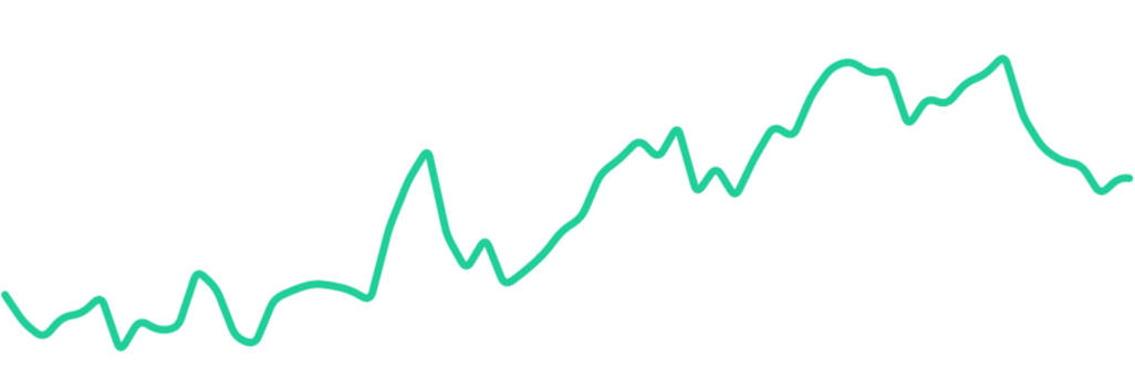
A simple Android sparkline chart view

Spark
Sparkline: a very small line chart, typically drawn without axes or coordinates. It presents the general shape of the variation (typically over time) in some measurement, such as temperature or stock market price, in a simple and highly condensed way.
Spark is a simple Android library that takes a series of x,y points at any scale and draws them as a
sparkline chart.
Usage
Spark is setup with reasonable default values out of the box. Just add a SparkView to your layout:
<LinearLayout
    xmlns:android="http://schemas.android.com/apk/res/android"
    android:layout_width="match_parent"
    android:layout_height="match_parent"
    android:orientation="vertical">

    <com.robinhood.spark.SparkView
        android:id="@+id/sparkview"
        android:layout_width="match_parent"
        android:layout_height="match_parent" />
</LinearLayout>
Then, just give it a SparkAdapter to graph your data:
SparkView sparkView = (SparkView) findViewById(R.id.sparkview);
sparkView.setAdapter(new MyAdapter(data));
...
public class MyAdapter extends SparkAdapter {
    private float[] yData;

    public MyAdapter(float[] yData) {
      this.yData = yData;
    }

    @Override
    public int getCount() {
      return yData.length;
    }

    @Override
    public Object getItem(int index) {
      return yData[index];
    }

    @Override
    public float getY(int index) {
      return yData[index];
    }
}
See spark-sample for a complete sample app.
Theming
Spark is very theme-friendly! It has default styles set for you, and welcomes any overrides:
In your Activity/Fragment/View:
sparkView.setLineColor(getColor(R.color.brand_color_primary));
In your layout xml:
    <com.robinhood.spark.SparkView
        android:id="@+id/sparkview"
        android:layout_width="match_parent"
        android:layout_height="match_parent"
        app:spark_lineColor="@color/brand_color_primary"/>
Set a default style for all SparkViews in your app's theme:
<resources>
    <style name="AppTheme" parent="Theme.AppCompat.Light.DarkActionBar">
        <item name="spark_SparkViewStyle">@style/MySparkViewStyle</item>
    </style>

    <style name="MySparkViewStyle" parent="@style/SparkView">
        <item name="spark_lineColor">@color/line_color</item>
        <item name="spark_lineWidth">@dimen/line_width</item>
        <item name="spark_cornerRadius">@dimen/corner_radius</item>
        <item name="spark_fill">false</item>

        <item name="spark_baseLineColor">@color/base_line_color</item>
        <item name="spark_baseLineWidth">@dimen/base_line_width</item>

        <item name="spark_scrubLineColor">@color/scrub_line_color</item>
        <item name="spark_scrubLineWidth">@dimen/scrub_line_width</item>
        <item name="spark_scrubEnabled">true</item>

        <item name="spark_animateChanges">true</item>
    </style>
</resources>
Scrubbing
Scrubbing is when the user taps and drags their finger along the sparkline chart. It is very useful
to display additional detail information about the point the user is currently scrubbing over.
Enable scrubbing via xml:
<com.robinhood.spark.SparkView
    ...
    app:spark_scrubEnabled="true" />
or programatically:
sparkView.setScrubEnabled(true);
and then add a SparkView.OnScrubListener to get callbacks:
sparkView.setScrubListener(new SparkView.OnScrubListener() {
        @Override
        public void onScrubbed(Object value) {
            scrubInfoTextView.setText(getString(R.string.scrub_format, value));
        }
    });
Base Line
It's frequently useful to show a "base line" against which the rest of the sparkline chart will be
compared. In your SparkAdapter, override hasBaseLine() to return true and then return the
appropriate base line value in getBaseline().
X Values
Spark assumes that your graph's points are evenly distributed across the x-axis. If that's not true,
just override getX(int index) in your SparkAdapter to give SparkView the correct value.
Animation
To animate sparkline changes, set an animator with sparkView.setSparkAnimator(sparkAnimator).
There are two built-in animators: LineSparkAnimator (default) and MorphSparkAnimator. Pass your own
implementation to achieve custom effects.
Data Boundaries
By default, Spark will calculate the min and max of your data set, and draw the sparkline as large as
possible within the View boundaries. If you want different behavior, such as "zooming in" on a portion
of your data, or "zooming out" to leave space between the sparkline and the side of the view, you
can override SparkAdapter.getDataBounds():
public class MyAdapter extends SparkAdapter {
    ...

    @Override
    public RectF getDataBounds() {
        RectF bounds = super.getDataBounds();
        // will 'zoom in' to the middle portion of the graph
        bounds.inset(bounds.width() / 4, bounds.height() / 4);
        return bounds;
    }
}
Vision
Spark is a very simple library and cannot possibly meet everyone's use-cases. A more robust charting
library (such as MP Android Chart) may be a better fit
if you're looking for things like axes or advanced touch gestures. Spark aims to be lightweight
alternative for showing simple sparklines. Spark will prioritize simplicity over new use-cases the
vast majority of the time.
Download
Gradle:
implementation 'com.robinhood.spark:spark:1.2.0'