A simple and customizable calendar widget for Android based on Material Design
Material-Calendar-View
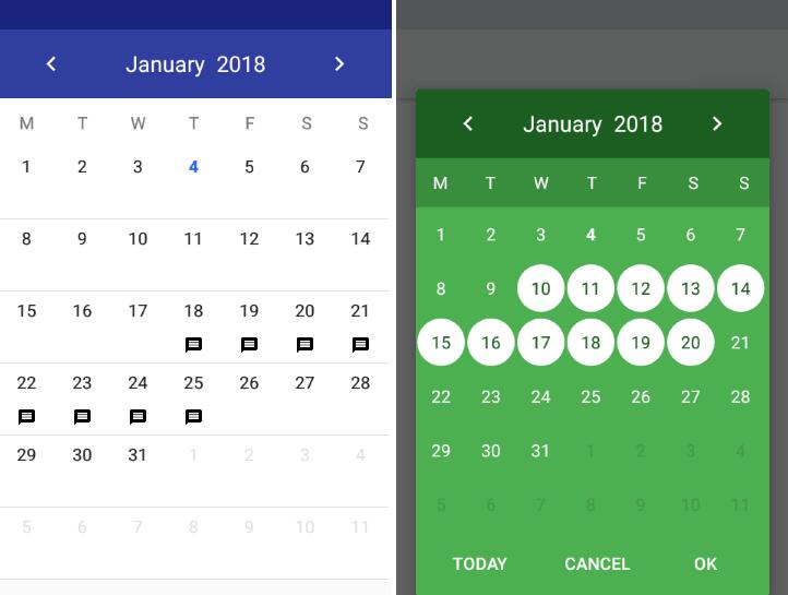
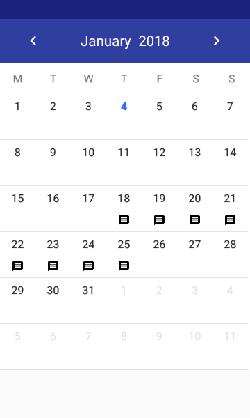
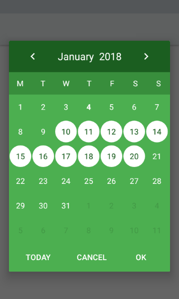
Material-Calendar-View is a simple and customizable calendar widget for Android based on Material Design. The widget has two funcionalities: a date picker to select dates (available as an XML widget and a dialog) and a classic calendar. The date picker can work either as a single day picker, many days picker or range picker.
Features
- Material Design
- Single date picker
- Many dates picker
- Range picker
- Events icons
- Fully colors customization
How to migrate from previous version to 1.4.0?
We have renamed setOnPreviousButtonClickListener() and setOnForwardButtonClickListener() so please refer to Previous and forward buttons listeners.
How to use?
Make sure you are using the newest com.android.support:appcompat-v7.
Make sure you have defined the jcenter() repository in project's build.gradle file:
allprojects {
    repositories {
        jcenter()
    }
}
Add the dependency to module's build.gradle file:
dependencies {
    compile 'com.applandeo:material-calendar-view:1.4.0'
}
To your XML layout file add:
<com.applandeo.materialcalendarview.CalendarView
    android:id="@+id/calendarView"
    android:layout_width="match_parent"
    android:layout_height="match_parent" />
Adding events with icons:
List<EventDay> events = new ArrayList<>();

Calendar calendar = Calendar.getInstance();
events.add(new EventDay(calendar, R.drawable.sample_icon));

CalendarView calendarView = (CalendarView) findViewById(R.id.calendarView);
calendarView.setEvents(events);
Clicks handling:
calendarView.setOnDayClickListener(new OnDayClickListener() {
    @Override
    public void onDayClick(EventDay eventDay) {
        Calendar clickedDayCalendar = eventDay.getCalendar();
    }
});
Getting a selected days in the picker mode:
If you want to get all selected days, especially if you use multi date or range picker you should use the following code:
List<Calendar> selectedDates = calendarView.getSelectedDates();
...or if you want to get the first selected day, for example in case of using single date picker, you can use:
Calendar selectedDate = calendarView.getFirstSelectedDate();
Setting a current date:
Calendar calendar = Calendar.getInstance();
calendar.set(2019, 7, 5);

calendarView.setDate(calendar);
Setting minumum and maximum dates:
Calendar min = Calendar.getInstance();
Calendar max = Calendar.getInstance();

calendarView.setMinimumDate(min);
calendarView.setMaximumDate(max);
Setting disabled dates:
List<Calendar> calendars = new ArrayList<>();
calendarView.setDisabledDays(calendars);
Previous and forward page change listeners:
calendarView.setOnPreviousPageChangeListener(new OnCalendarPageChangeListener() {
    @Override
    public void onChange() {
        ...
    }
});

calendarView.setOnForwardPageChangeListener(new OnCalendarPageChangeListener() {
    @Override
    public void onChange() {
        ...
    }
});
Customization
If you want to use calendar in the picker mode, you have to use the following tags:
app:type="one_day_picker"app:type="many_days_picker"app:type="range_picker"
Colors customization:
- Header color:
app:headerColor="[color]" - Header label color:
app:headerLabelColor="[color]" - Previous button image resource:
app:previousButtonSrc="[drawable]" - Forward button image resource:
app:forwardButtonSrc="[drawable]" - Abbreviations bar color:
app:abbreviationsBarColor="[color]" - Abbreviations labels color:
app:abbreviationsLabelsColor="[color]" - Calendar pages color:
app:pagesColor="[color]" - Selection color in picker mode:
app:selectionColor="[color]" - Selection label color in picker mode:
app:selectionLabelColor="[color]" - Days labels color:
app:daysLabelsColor="[color]" - Color of visible days labels from previous and next month page:
app:anotherMonthsDaysLabelsColor="[color]" - Disabled days labels color:
app:disabledDaysLabelsColor="[color]" - Today label color:
app:todayLabelColor="[color]"
Translations:
To translate months names, abbreviations of days, "TODAY", "OK" and "CANCEL" buttons, just add below tags to your strings.xml file:
<string name="material_calendar_monday">M</string>
<string name="material_calendar_tuesday">T</string>
<string name="material_calendar_wednesday">W</string>
<string name="material_calendar_thursday">T</string>
<string name="material_calendar_friday">F</string>
<string name="material_calendar_saturday">S</string>
<string name="material_calendar_sunday">S</string>

<array name="material_calendar_months_array">
    <item>January</item>
    <item>February</item>
    <item>March</item>
    <item>April</item>
    <item>May</item>
    <item>June</item>
    <item>July</item>
    <item>August</item>
    <item>September</item>
    <item>October</item>
    <item>November</item>
    <item>December</item>
</array>

<string name="material_calendar_today_button">Today</string>
<string name="material_calendar_positive_button">OK</string>
<string name="material_calendar_negative_button">Cancel</string>
Date Picker Dialog
DatePickerBuilder builder = new DatePickerBuilder(this, listener)
                .pickerType(CalendarView.ONE_DAY_PICKER);

DatePicker datePicker = builder.build();
datePicker.show();
To use another picker type replace CalendarView.ONE_DAY_PICKER with CalendarView.MANY_DAYS_PICKER or CalendarView.RANGE_PICKER.
Getting date handling:
private OnSelectDateListener listener = new OnSelectDateListener() {
    @Override
    public void onSelect(List<Calendar> calendars) {
        ...
    }
};
Customization:
new DatePickerBuilder(this, listener)
        .date(Calendar.getInstance()) // Initial date as Calendar object
        .minimumDate(Calendar.getInstance()) // Minimum available date
        .maximumDate(Calendar.getInstance()) // Maximum available date
        .disabledDays(List<Calendar>) /// List of disabled days
        .headerColor(R.color.color) // Color of the dialog header
        .headerLabelColor(R.color.color) // Color of the header label
        .previousButtonSrc(R.drawable.drawable) // Custom drawable of the previous arrow
        .forwardButtonSrc(R.drawable.drawable) // Custom drawable of the forward arrow
        .previousPageChangeListener(new OnCalendarPageChangeListener(){}) // Listener called when scroll to the previous page
        .forwardPageChangeListener(new OnCalendarPageChangeListener(){}) // Listener called when scroll to the next page
        .abbreviationsBarColor(R.color.color) // Color of bar with day symbols
        .abbreviationsLabelsColor(R.color.color) // Color of symbol labels
        .pagesColor(R.color.sampleLighter) // Color of the calendar background
        .selectionColor(R.color.color) // Color of the selection circle
        .selectionLabelColor(R.color.color) // Color of the label in the circle
        .daysLabelsColor(R.color.color) // Color of days numbers
        .anotherMonthsDaysLabelsColor(R.color.color) // Color of visible days numbers from previous and next month page
        .disabledDaysLabelsColor(R.color.color) // Color of disabled days numbers
        .todayLabelColor(R.color.color) // Color of the today number
        .dialogButtonsColor(R.color.color); // Color of "Cancel" and "OK" buttons