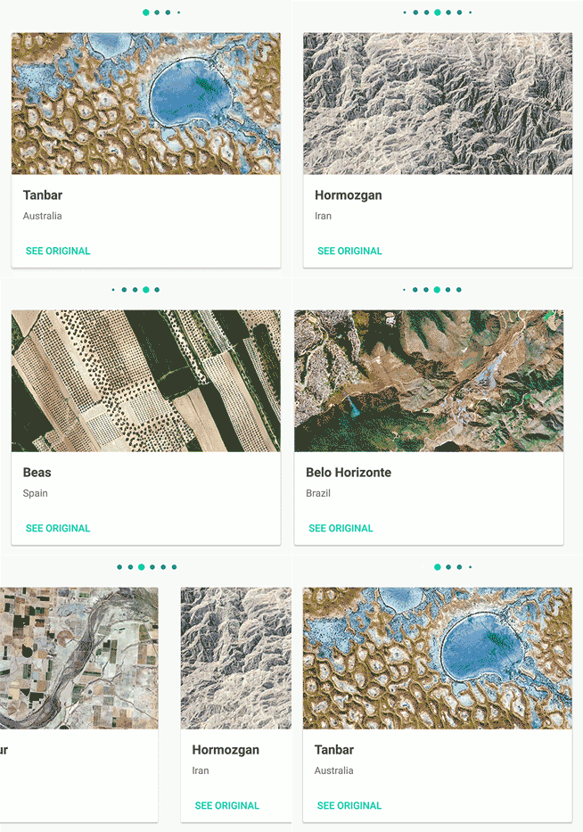
A lightweight and plug-and-play indefinite pager indicator for RecyclerViews

Android Indefinite Pager Indicator
A lightweight, plug-and-play indefinite pager indicator for RecyclerViews & ViewPagers.

Usage
To use the IndefinitePagerIndicator, simply add the gradle dependency to your module's build.gradle file:
compile 'com.ryanjeffreybrooks:indefinitepagerindicator:1.0.8'
Min SDK supported is version 16 - Jelly Bean.
Getting Started
Attaching the indicator to a RecyclerView or Viewpager takes only one line of code. After this, the Indefinite Pager Indicator will handle everything else.
RecyclerView
- Add the IndefinitePagerIndicator view to your XML file
<com.rbrooks.indefinitepagerindicator.IndefinitePagerIndicator
        android:id="@+id/recyclerview_pager_indicator"
        android:layout_width="wrap_content"
        android:layout_height="wrap_content"
        ...
        />
- Find the view in your activity, fragment, etc.
findViewById(R.id.recyclerview_pager_indicator);
- Attach the RecyclerView to your IndefinitePagerIndicator
indefinitePagerIndicator.attachToRecyclerView(recyclerView);
That's it! The IndefinitePagerIndicator will handle updating as your RecyclerView does.
ViewPager
- Add the IndefinitePagerIndicator view to your XML file
<com.rbrooks.indefinitepagerindicator.IndefinitePagerIndicator
        android:id="@+id/viewpager_pager_indicator"
        android:layout_width="wrap_content"
        android:layout_height="wrap_content"
        ...
        />
- Find the view in your activity, fragment, etc.
findViewById(R.id.viewpager_pager_indicator);
- Attach the ViewPager to your IndefinitePagerIndicator
indefinitePagerIndicator.attachToViewPager(viewPager);
That's it! The IndefinitePagerIndicator will handle updating as your ViewPager does.
The position of the ViewPager can also be changed programmatically with viewPager.setCurrentItem(position) and the IndefinitePagerIndicator will update successfully.
Sample
A sample application is included in the repository. To view the sample:
- Clone the repository locally
git clone git@github.com:rbro112/Android-Indefinite-Pager-Indicator.git
- Build and run the sample module.
Customizing
To customize the IndefinitePagerIndicator, modify any of the following attributes in the XML code for your IndefinitePagerIndicator view.
| Attribute | Explanation | Default Value | Example Code | Result |
|---|---|---|---|---|
| dotRadius | The radius of a dot indicator in DP. | 4dp | app:dotRadius="8dp" |
|
| selectedDotRadius | The radius of the currently selected dot indicator in DP. | 5.5dp | app:selectedDotRadius="6dp" |
|
| dotColor | The color of a dot indicator. | #e8e8e8 | app:dotColor="#ff0000" |
|
| selectedDotColor | The color of the currently selected dot indicator. | #ffffff | app:selectedDotColor="#ff0000" |
|
| dotSeparation | The distance from edge to edge of each dot in DP. | 10dp | app:dotSeparation="16dp" |
|
| dotCount | The number of large visible dot indicators at any time. | 5 | app:dotCount="3" |
|
| fadingDotCount | The number of dot indicators that fade towards the edge. | 1 | app:fadingDotCount="2" |
|
| supportRTL | Adds support for RTL ViewPagers (Thanks @wching!) | false | app:supportRTL="true" |
If current layout mode is RTL, indicator will move from right to left with scrolling. |
TODO:
Actively working on these. If you would like to help, submit a PR!
-
"Instagram" style -- Selected dot starts at the left of the view rather than starting in the center.
-
Vertical layout support.
-
Support for padding.