A library to help making responsive layouts

Layout Scaffold
About
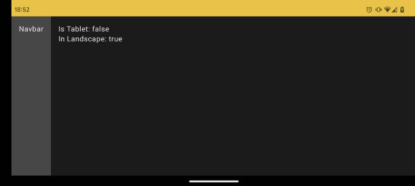
This library adds a composable to make developers life easier when it comes to have a proper layout. According to material3 guidelines the navbar should be on the left and not in the bottom when the device it’s in landscape. This composable can detect if the device is a tablet too which can be handy depending on how you design your app.
Screenshots
Click to see the screenshotsSmartphone
Tablet
How to add the library
Adding Jitpack URL
If you use Groovy DSL (settings.gradle)
dependencyResolutionManagement {
    repositoriesMode.set(RepositoriesMode.FAIL_ON_PROJECT_REPOS)
    repositories {
        //...
        maven { url 'https://jitpack.io' }
    }
}
If you use Kotlin DSL (settings.gradle):
dependencyResolutionManagement {
  repositoriesMode.set(RepositoriesMode.FAIL_ON_PROJECT_REPOS)
  repositories {
      //...
      maven("https://jitpack.io")
  }
}
Adding dependency in gradle
On your app gradle add:
//If you use Groovy DSL
implementation 'com.github.lighttigerXIV:layout-scaffold:1.0.2'

//If you use Kotlin DSL
implementation ("com.github.lighttigerXIV:layout-scaffold:1.0.2")
How to use
To use it just simply use it like this:
LayoutScaffold(
  portraitNavigationBar = {
      // Your portrait navbar content
  },
  landscapeNavigationBar = {
      // Your landscape navbar content
  }
){isTablet, inLandscape ->
  // Your app content
}
Note: The portraitNavigationBar and landscapeNavigationBar are optional so you may only need the following:
LayoutScaffold{isTablet, inLandscape ->
  // Your app content
}