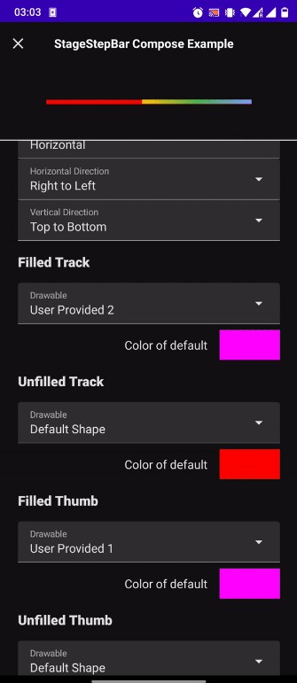
A feature rich staged progress bar with modifiable steps in between its stages

StageStepBar
A staged progressbar that you can use if you want finer control of the steps in between its stages. You can customize:
- Number of steps between particular stages
- Look and feel of tracks and thumbs (stages)
- Direction and Orientation of the bar
- Animation speed (or even type in Compose)
Showcase
Best way to test how this library is configured is to check out:
- example module if you are interested in the View library.
- example-compose module if you are interested in the Compose library.
Installation
Add Jitpack distribution to the end of the repositories in your root build.gradle file.
allprojects {
    repositories {
        ...
        maven { url 'https://jitpack.io' }
    }
}
Add the relevant dependency to the list of dependencies in your module’s build.gradle file
<div class="highlight highlight-source-groovy position-relative" data-snippet-clipboard-copy-content="dependencies {
// Add only this one if you want to include the View version
implementation 'com.github.loukwn.StageStepBar:stagestepbar:’
// Add only this one if you want to include the Compose version
implementation ‘com.github.loukwn.StageStepBar:stagestepbar-compose:’
}
“>
dependencies {
    // Add only this one if you want to include the View version
    implementation 'com.github.loukwn.StageStepBar:stagestepbar:'

    // Add only this one if you want to include the Compose version
    implementation 'com.github.loukwn.StageStepBar:stagestepbar-compose:'
}
Usage
Usage as a View
In XML:
<div class="highlight highlight-text-xml position-relative" data-snippet-clipboard-copy-content="
“>
<com.loukwn.stagestepbar.StageStepBar
    android:id="@+id/stageStepBar"
    android:layout_width="200dp"
    android:layout_height="100dp"
    app:ssb_stageStepConfig="5,5,5"
    app:ssb_animationDuration="500"
    /*...*/
     />
In Code:
<div class="highlight highlight-source-kotlin position-relative" data-snippet-clipboard-copy-content="val stageStepBar = findViewById(R.id.stageStepBar)
stageStepBar.setStageStepConfig(listOf(6,2,7))
“>
val stageStepBar = findViewById<StageStepBar>(R.id.stageStepBar)
stageStepBar.setStageStepConfig(listOf(6,2,7))
Configuration
All XML attributes are optional (set to their defaults).
| XML attribute | Default | Description |
|---|---|---|
ssb_stageStepConfig |
"1" |
This is a list in a string form that describes the steps per stages. For example a value of 6,4,3 means 6 steps from stage 0 to 1, 4 from stage 1 to 2 and 3 steps from stage 2 to 3.
In code: |
ssb_currentState |
null |
This is a list in a string form that describes the current state. For example a value of 2,4 means go to stage 2, step 4. Both the stage and the step provided here are coerced to the largest possible value (according to stageStepConfig). A null value here means that nothing is filled.
In code: |
ssb_animate |
true |
Whether or not the progress change will animate.
In code: |
ssb_animationDuration |
500 |
The duration of the animation
In code: |
ssb_orientation |
horizontal |
Whether the bar is horizontal or vertical.
In code: |
ssb_horizontalDirection |
auto |
The direction of the bar if it is horizontal. Possible values: auto (based on locale). ltr, rtl.
In code: |
ssb_verticalDirection |
btt |
The direction of the bar if it is vertical. Possible values: ttb (Top to Bottom). btt, (Bottom to Top).
In code: |
ssb_filledTrackColor |
#000000 |
The color of the track when it is filled.
In code: |
ssb_unfilledTrackColor |
#A9A9A9 |
The color of the track when it is not filled.
In code: |
ssb_filledThumbColor |
#000000 |
The color of the thumbs when they are filled.
In code: |
ssb_unfilledThumbColor |
#6F6F6F |
The color of the thumbs when they are not filled.
In code: |
ssb_filledTrackDrawable |
– | Sets a custom drawable to the filled track.
In code: |
ssb_unfilledTrackDrawable |
– | Sets a custom drawable to the unfilled track.
In code: |
ssb_filledThumbDrawable |
– | Sets a custom drawable to the filled thumbs.
In code: |
ssb_unfilledThumbDrawable |
– | Sets a custom drawable to the unfilled thumbs.
In code: |
ssb_thumbSize |
20dp |
The size of the thumbs (both filled and unfilled).
In code: |
ssb_crossAxisFilledTrackSize |
6dp |
The height of the filled track if the bar is horizontal or its width if it is vertical.
In code: |
ssb_crossAxisUnfilledTrackSize |
6dp |
The height of the unfilled track if the bar is horizontal or its width if it is vertical.
In code: |
ssb_showThumbs |
true |
Whether or not to show the thumbs.
In code: |
Note: Both thumbs and tracks can either have:
- A default shape but with the color specified by the user. Calling a
set*ToNormalShape()function takes you to this state. - Their entire look overriden by a custom Drawable. Calling a
set*ToCustomDrawable()function takes you to this state.
Usage as a Composable
@Composable
fun Example() {
    StageStepBar(
        modifier = Modifier...,
        config = StageStepBarConfig(
            stageStepConfig = listOf(12,45,1)
            //...
        )
    )
}
The full configuration model is pretty much the same between the Compose and the View version. However there are differences (mostly due to things that Compose makes easier):
- Instead of specifying an
Intin pixels for the sizes of thumbs and/or tracks, in the Compose version that is passed inDp. - Instead of just specifying a duration value for the animation, in the Compose version one can pass instead an
AnimationSpeceffectively taking advantage of other kinds of animations likespring()etc. - Instead of passing a
Drawable, in Compose one will need to pass anImageBitmap(because of what the Canvas in this case expects).
These differences aside, the behavior between the two versions should be pretty much identical.
Licence
StageStepBar is available under MIT license. See LICENSE file for more information.
