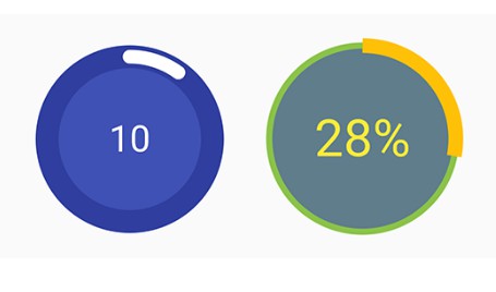
A customisable circular progress view for android

Circular Progress View
A customisable circular progress view for android.

Highlights:
- Depends on Kotlin(1.2.70) and Android Support(28.0.0-rc02)
- minSdkVersion(14) and targetSdkVersion(28)
- View state is retained on configuration change
Attributes:
| Attribute | Type | Description |
|---|---|---|
| app:total | Integer | Total progress. By default it is 100. |
| app:totalColor | Color | Total progress color |
| app:totalWidth | Dimension | Width of total progress |
| app:progress | Integer | Current progress. It should be less than or equal to "total". It will be set to "total" if it is set to more than "total" |
| app:progressColor | Color | Current progress color |
| app:progressWidth | Dimension | Width of current progress |
| app:progressRoundCap | Boolean | Enable or disable rounded cap of current progress. Disabled by default. |
| app:progressTextEnabled | Boolean | Enable or disable the progress text. Disabled by default. |
| app:progressTextType | Enum (progress or percent) | "progress" will show the value of current progress and "percent" will show percent of current progress out of total. By default it is "progress" |
| app:progressTextSize | Dimension | Text size of progress text |
| app:progressTextColor | Color | Color of progress text |
| app:fillColor | Color | Fill color begins from center of the view to the inner radius of the total progress |
| app:startAngle | Float | Start angle in degrees for current progress. By default it is 270 so that it starts from the top. |
| app:animate | Boolean | Enable or disable animation when current progress changes. Disabled by default. |
| app:animateDuration | Integer | Current progress change animate duration in milliseconds. 300 ms by default. |
Usage:
<com.vaibhavlakhera.circularprogressview.CircularProgressView
        android:id="@+id/progressView"
        android:layout_width="164dp"
        android:layout_height="164dp"
        app:animate="true"
        app:animateDuration="600"
        app:fillColor="@color/colorPrimary"
        app:progress="10"
        app:progressColor="#FFF"
        app:progressRoundCap="true"
        app:progressTextColor="#FFF"
        app:progressTextEnabled="true"
        app:progressTextSize="32sp"
        app:progressTextType="progress"
        app:progressWidth="12dp"
        app:startAngle="270"
        app:total="100"
        app:totalColor="@color/colorPrimaryDark"
        app:totalWidth="20dp" />
Add it to your project:
Step 1. Add the JitPack repository to your root build.gradle at the end of repositories
allprojects {
  repositories {
    ...
    maven { url 'https://jitpack.io' }
  }
}
Step 2. Add the dependency
dependencies {
  implementation 'com.github.VaibhavLakhera:Circular-Progress-View:0.1.0'
}