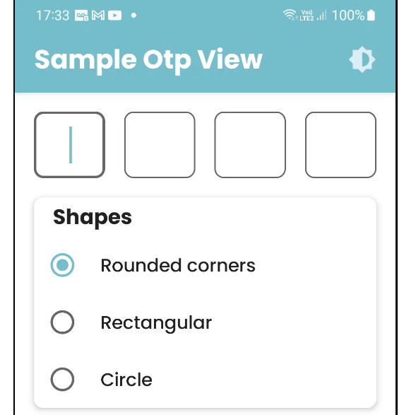
A custom text field to enter a code usually used in cases of authentication

Otp View – Jetpack Compose
A custom text field to enter a code usually used in cases of authentication.
Getting Started
Step 1. Include repository jitpack io in gradle (project).
allprojects {
    repositories {
 	maven { url 'https://jitpack.io' }
    }
}
Step 2. Add the dependency in gradle (app).
dependencies {
    implementation("com.sugarspoon.otpview:$latest_version")
}
How to use the component?
var otpValue by remember { mutableStateOf("") }
var isError by remember { mutableStateOf(false) }
OtpView(
    modifier = Modifier,
    colors = TextFieldDefaults.textFieldColors(
        backgroundColor = BackgroundPinColor,
        textColor = TextColor,
        errorLabelColor = FeedbackError,
        errorCursorColor = FeedbackError,
        errorIndicatorColor = FeedbackError
    ),
    onAllDigitsFilled = { digitsFilled ->
        otpValue = digitsFilled
        isError = otpValue != "1234"
    },
    isError = isError,
    isEnable = true,
    isSecret = true,
    onPressedDelKey = {
        isError = false
    },
    styles = OtpViewStyles.default(otpSize = OtpSize.FOUR, shape = state.shape)
)
| Param | Description |
|---|---|
| modifier | An ordered, immutable collection of modifier elements that decorate or add behavior to Compose UI elements. For example, backgrounds, padding and click event listenersdecorate or add behavior to rows, text or buttons. |
| colors | Represents the colors of the input text, background and content used in a text field in different states. |
| styles | Defines text style, shape and number of text fields. |
| isSecret | Defines whether to show or hide the entered number. Default [false] |
| isError | Indicates if the text field’s current value is in error state. If set to true, the label, shape and border will be displayed in error color. Default [false] |
| isEnabled | Controls the enabled state of the [OtpView]. When false, the text field will be neither editable nor focusable, the input of the text field will not be selectable. |
| keyboardType | The keyboard type to be used in this text field. Note that this input type is honored by keyboard and shows corresponding keyboard but this is not guaranteed. For example, some keyboards may send non-ASCII character even if you set KeyboardType.Ascii. |
| visualTransformation | transforms the visual representation of the input value.When [isSecret] is true this visual transformation will be applied. Default [OtpViewVisualTransformation] |
| onAllDigitsFilled | Indicates when all fields are filled. |
| onPressDellKey | Indicates when delete key is pressed. |