A button to substitute the ProgressDialog
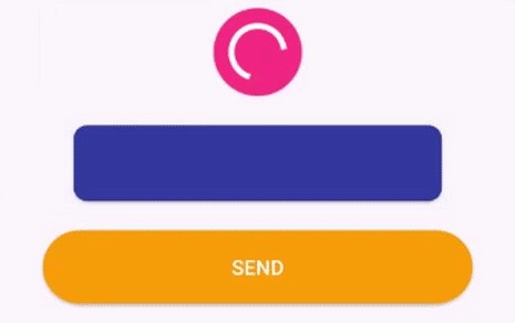
Progress Button Android
Android Button that morphs into a loading progress bar.
- Fully customizable in the XML
- Really simple to use.
- Makes your app looks cooler =D
You can check how this library was implemented here: https://medium.com/p/9efee6e39711/
Installation
implementation 'br.com.simplepass:loading-button-android:1.14.0'
How to use
Animate and revert animation
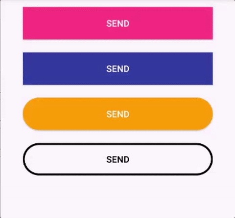
Add the button in your layout file and customize it the way you like it.
  <br.com.simplepass.loading_button_lib.customViews.CircularProgressButton
    	    android:id="@+id/btn_id"
    	    android:layout_width="match_parent"
            android:layout_height="wrap_content"
            android:background="@drawable/circular_border_shape"
            app:spinning_bar_width="4dp" <!-- Optional -->
            app:spinning_bar_color="#FFF" <!-- Optional -->
            app:spinning_bar_padding="6dp" <!-- Optional -->
Then, instanciate the button
    CircularProgressButton btn = (CircularProgressButton) findViewById(R.id.btn_id)

    btn.startAnimation();

[do some async task. When it finishes]
//You can choose the color and the image after the loading is finished
	btn.doneLoadingAnimation(fillColor, bitmap);
	[or just revert de animation]
	btn.revertAnimation();
Switch to determinant progress
You can switch between indeterminant and determinant progress:
circularProgressButton.setProgress(10)
...
circularProgressButton.setProgress(100)
...
circularProgressButton.resetProgress()
- Show 'done' animation
When the loading animation is running, call:
//Choose the color and the image that will be show
circularProgressButton.doneLoadingAnimation(fillColor, bitmap);
- Revert the loading animation with different text or image
circularProgressButton.revertAnimation(new OnAnimationEndListener() {
                @Override
                public void onAnimationEnd() {
                    circularProgressButton.setText("Seu texto aqui!");
                }
            });
or
circularProgressImageButton.revertAnimation(new OnAnimationEndListener() {
        @Override
        public void onAnimationEnd() {
            progressButton.setImageDrawable(R.drawable.image);
        }
    });
Configure XML
- app:spinning_bar_width : Changes the width of the spinning bar inside the button
- app:spinning_bar_color: Changes the color of the spinning bar inside the button
- app:spinning_bar_padding: Changes the padding of the spinning bar in relation of the button bounds.
- app:initialCornerAngle: The initial corner angle of the animation. Insert 0 if you have a square button.
- app:finalCornerAngle: The final corner angle of the animation.
Avoid Memory Leaks
To avoid memory leaks is your code, you must dispose the buttons in the onDestroy method. Example:
override fun onDestroy() {
        super.onDestroy()

        progressButton.dispose()
 }