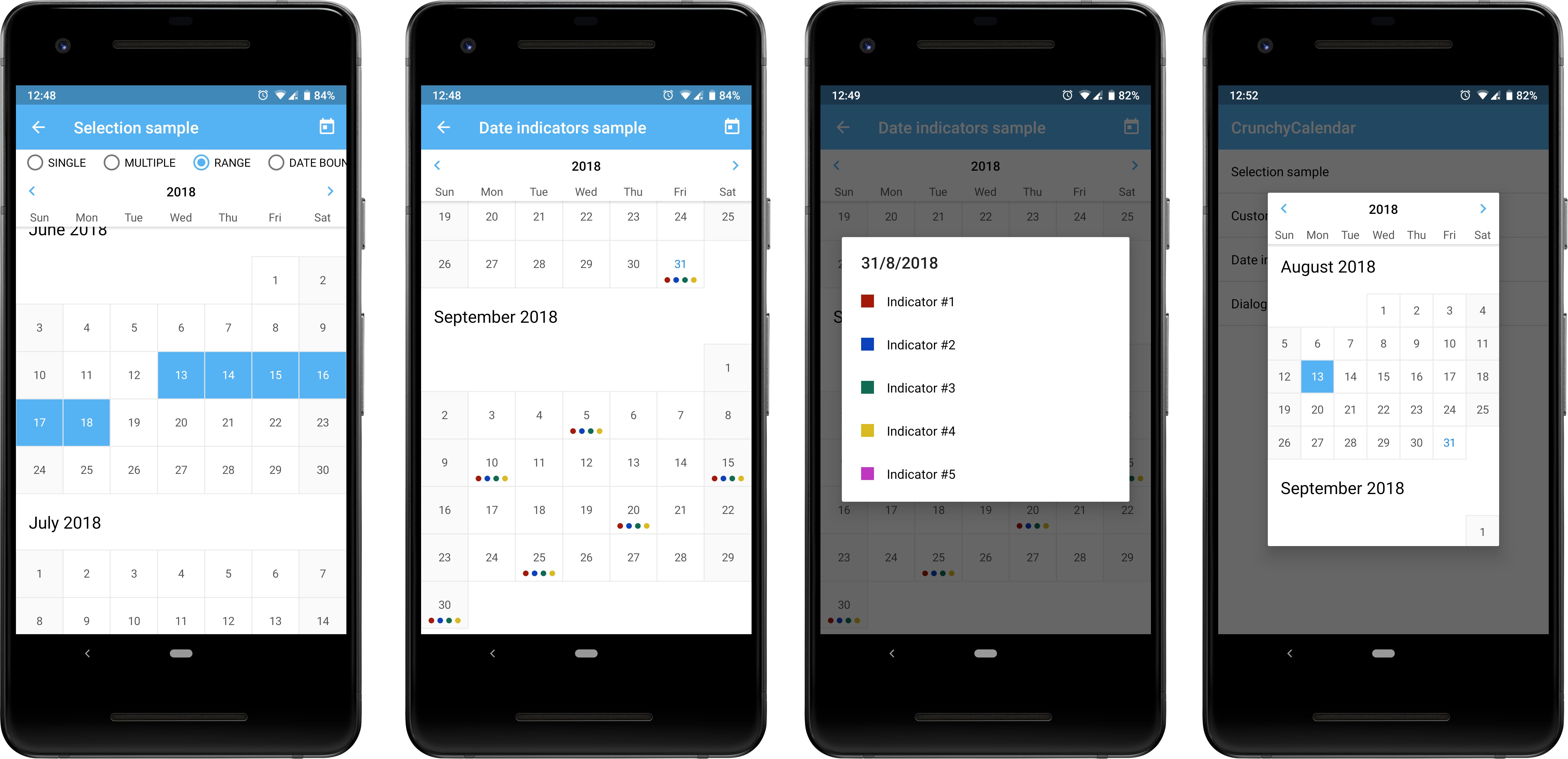
CrunchyCalendar
A beautiful material calendar with endless scroll, range selection and a lot more!
A light, powerful and easy to use Calendar Widget with a number out of the box features:
- Infinite vertical scrolling in both directions;
- Setting date boundaries to restrict scrolling inside of a specific time period;
- Single / multiple / range dates selection;
- Pre-selecting dates;
- Color customization;
- Displaying color indicators;
- Setting own custom ItemDecoration;
- Presented as a View subclass which can be displayed everywhere: in Activity, Fragment or Dialog,
or can be integrated into another custom View.
Dependency
This library is available on jCenter. jCenter is the default Maven repository used by Android Studio.
Gradle
implementation 'ru.cleverpumpkin:crunchycalendar:1.1.0'
Maven
<dependency>
  <groupId>ru.cleverpumpkin</groupId>
  <artifactId>crunchycalendar</artifactId>
  <version>1.1.0</version>
  <type>pom</type>
</dependency>
Usage
Here's a basic example of Calendar usage.
First of all, you should declare CalendarView in your layout XML file.
  <ru.cleverpumpkin.calendar.CalendarView
        android:id="@+id/calendar_view"
        android:layout_width="match_parent"
        android:layout_height="match_parent" />
Perform Calendar setup in your Activity or Fragment class.
val calendarView = view.findViewById(R.id.calendar_view)
val calendar = Calendar.getInstance()

// Initial date
calendar.set(2018, Calendar.JUNE, 1)
val initialDate = CalendarDate(calendar.time)

// Minimum available date
calendar.set(2018, Calendar.MAY, 15)
val minDate = CalendarDate(calendar.time)

// Maximum available date
calendar.set(2018, Calendar.JULY, 15)
val maxDate = CalendarDate(calendar.time)

// List of preselected dates that will be initially selected
val preselectedDates: List<CalendarDate> = getPreselectedDates()

// The first day of week
val firstDayOfWeek = java.util.Calendar.MONDAY

// Set up calendar with all available parameters
calendarView.setupCalendar(
    initialDate = initialDate,
    minDate = minDate,
    maxDate = maxDate,
    selectionMode = SelectionMode.NON,
    selectedDates = preselectedDates,
    firstDayOfWeek = firstDayOfWeek,
    showYearSelectionView = true
)
Note: all parameters in setupCalendar() method are optional and have default values.
To handle date click / long click with custom action, you can do this:
// Set date click callback
calendarView.onDateClickListener = { date ->

    // Do something ...
    // for example get list of selected dates
    val selectedDates = calendarView.selectedDates
}

// Set date long click callback
calendarView.onDateLongClickListener = { date ->

    // Do something ...
}
Saving and Restoring state
Calendar takes care of saving and restoring its internal state (selected dates, selection mode, etc.),
so there's no need to save it manually and call setupCalendar() method every time,
when Activity or Fragment is recreated.
If a Calendar was set up with setupCalendar() method before restoring state, previous saved
state will be ignored.
Dates Selection
Calendar supports several selection modes: single, multiple and range.
Note: You can restrict selection of some dates by implementing your own filtration logic:
// Here we make weekends unavailable for selection
calendarView.dateSelectionFilter = { date ->
    date.dayOfWeek != Calendar.SATURDAY && date.dayOfWeek != Calendar.SUNDAY
}
Single date selection
Only one date can be selected at a time.
// Set up calendar with SelectionMode.SINGLE
calendarView.setupCalendar(selectionMode = SelectionMode.SINGLE)

...

// Get selected date or null
val selectedDate: CalendarDate? = calendarView.selectedDate

// Get list with single selected date or empty list
val selectedDates: List<CalendarDate> = calendarView.selectedDates
Multiple dates selection
A number of dates can be selected. Pressing an already selected date will unselect it.
// Set up calendar with SelectionMode.MULTIPLE
calendarView.setupCalendar(selectionMode = SelectionMode.MULTIPLE)

...

// Get all selected dates in order they were added or empty list
val selectedDates: List<CalendarDate> = calendarView.selectedDates
Range date selection
Allows you to select a date range. Previous selected range is cleared when you select another one.
// Set up calendar with SelectionMode.RANGE
calendarView.setupCalendar(selectionMode = SelectionMode.RANGE)

...

// Get all selected dates in range (includes start and end date) or empty list
val selectedDates: List<CalendarDate> = calendarView.selectedDates
Color Indicators
The Calendar is able to display simple color indicators (dots) on the date cell.
Color indicator represents as simple interface, which you can implement in your classes.
interface DateIndicator {
    val date: CalendarDate // indicator date
    val color: Int // indicator color
}
Here's an example of setting indicators to display on the Calendar.
// Set up calendar
calendarView.setupCalendar()


val indicators: List<DateIndicator> = getDatesIndicators()

// Set List of indicators that will be displayed on the calendar
calendarView.datesIndicators = indicators
To get all indicators for specific date, you can do this:
// Set date click callback
calendarView.onDateClickListener = { date ->

    // Get all indicators for the date
    val indicatorsForDate = calendarView.getDateIndicators(date)

    // do something ...
}
View Customization
Calendar appearance can be customized with XML attributes. Here's an example of applying custom style for changing Calendar appearance.
Define your custom style for the Calendar.
<style name="CalendarViewCustomStyle">
    <item name="android:background">@android:color/white</item>
    <item name="calendar_date_background">@drawable/custom_date_bg_selector</item>
    <item name="calendar_date_text_color">@color/custom_date_text_selector</item>
    <item name="calendar_day_bar_background">@color/custom_calendar_days_bar_background</item>
    <item name="calendar_day_bar_text_color">@color/custom_calendar_days_bar_text_color</item>
    <item name="calendar_grid_color">@color/custom_calendar_grid_color</item>
    <item name="calendar_grid_on_selected_dates">false</item>
    <item name="calendar_month_text_color">@color/custom_calendar_month_text_color</item>
    <item name="calendar_year_selection_arrows_color">
        @color/custom_calendar_year_selection_arrows_color
    </item>
    <item name="calendar_year_selection_background">
        @color/custom_calendar_year_selection_background
    </item>
    <item name="calendar_year_selection_text_color">
        @color/custom_calendar_year_selection_text_color
    </item>
</style>
Apply your custom style.
<ru.cleverpumpkin.calendar.CalendarView
    android:id="@+id/calendar_view"
    style="@style/CalendarViewCustomStyle"
    android:layout_width="match_parent"
    android:layout_height="match_parent" />
You can also apply custom style for all Calendars in your app at once.
<style name="AppTheme" parent="Theme.AppCompat.Light.NoActionBar">

    <!-- ...snip... -->

    <item name="calendarViewStyle">@style/CalendarViewCustomStyle</item>

    <!-- ...etc... -->
</style>
If you need to do some custom drawing logic for Calendar, you can implement standard
RecyclerView.ItemDecoration and add it for Calendar using addCustomItemDecoration() method.
// Set up calendar
calendarView.setupCalendar()

// Some custom decoration logic
val customItemDecoration = CustomItemDecoration()

// Add custom item decoration for calendar
calendarView.addCustomItemDecoration(customItemDecoration)
There is an abstract helper class AbsDateItemDecoration that you can extend to implement custom
drawing logic for specific dates cells.